Forbes Magazine Case Study
A walkthrough of my mobile app redesign for Forbes Magazine’s app
Design challenge and responsibilities overview
PROCESS HIGHLIGHTS
Timeline
Nov 7-29, 2023
Responsibilities
Tools
UX Research
Design Thinking
Figma
Notion
Wireframing
Prototyping
User Experience Design
User Interface Design
Disciplines
Challenge
Class Prompt: Redesign a mobile app or website.
Redesign the Forbes Magazine App to reflect the website and create a better reading/searching experience.
Opportunity
Understanding the company and their goals
BACKGROUND
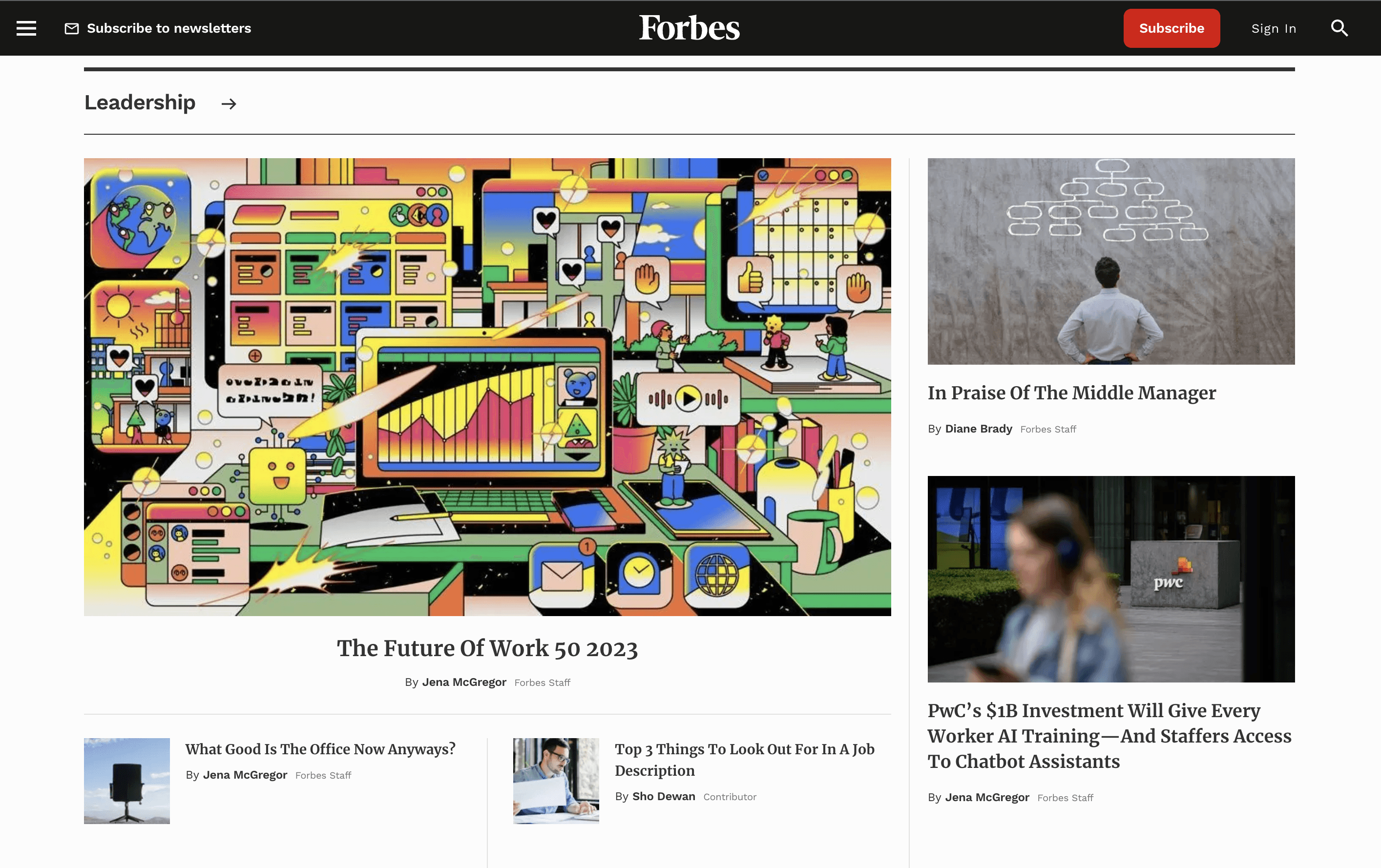
The app intends to provide you with a unique magazine experience that seamlessly integrates Forbes' content with Forbes magazines on your mobile device. Inside these magazines, you'll discover stories about influential entrepreneurs, innovative companies, and valuable strategic insights. Forbes, known as the voice of entrepreneurial capitalism, with over 140 million global readers, is a trusted source for business and finance insights.
The Process
Research
Desk Research
Competitor Analysis
Identifying Problems
Synthesis
Persona
Ideation
Developing a Solution
Moodboard
Mid Fidelity
Final Designs
Final Prototype
Reflection
Conclusion
1
2
3
4
5
Desk Research
RESEARCH
Before diving into designs, I wanted to first look at Forbes’ website to see what key details the mobile app was missing. After doing some research, I realized how limited the mobile app truly was; things as simple as having categories were not included in the mobile app.
Competitor Analysis
RESEARCH
My competitor analysis involves delving into how Forbes caters to the needs of people looking for informative news based on their interested, and specifically examining how competitors like the New York Times, Business Insider, and the Washington Post create a more accessible and user-friendly reading/searching experience.
Customizable Screen
Customizable Notifications
Light/Dark Mode
Visible Search Icon
Bottom Navigation Bar
Change Font Size
Share
Save
Featured
Somewhat Featured
Not Featured


After conducting desk research and competitor analysis, I wanted to direct my attention to real users, focusing on issues people actually have as they are actively using it was key to finding what needed to be improved. Below are some of the most critical feedback from the App store.
To define the problem, users want enhanced customization options and features, along with a more user-friendly navigation system. This entails the incorporation of features such as a search engine, categories, font size adjustment, light/dark mode, notification settings, and the ability to save and comment on content.
Identifying Problems
RESEARCH


August 16 - Access is Too Painful. This is one of the most annoying apps I have come across. I currently have a subscription that expires in 6 months. I get countless prompts to enter my information and renew. I’ve lost track of how many times I have entered my info, but it doesn’t seem to recognize any of it. The customer experience is just AWFUL.
Nov 9 - Great website horrible app. Forbes makes enough money to hire a new app developer. This app is a disgrace.
1 year ago - Worse app ever!! It takes a lot to get me to write a review. But this is horrible. Construction crashes. Confusing articles between free articles and paid articles and Forbes.com and whatever they offer. It’s just horrible. Save yourself the frustration and get the paper version.
July 31 - Old and freezes. This app is over a year old and freezes or crashes so often. I want a subscription refund.
To understand the user better, I developed a user persona to represent our ideal user. Specifically, Forbes magazine caters to a broad and diverse readership, encompassing business professionals, entrepreneurs, investors, executives, and individuals interested in finance and business-related topics. Its monthly digital platform draws approximately 46 million unique visitors, with 58% male and 42% female users. Notably, 43% of users fall within the age range of 30 to 49 years old.
User Persona
SYNTHESIS
Jackson Miller, 35
Co-founder of Tech Startup
MBA in Finance
New York City
Jackson is wholeheartedly dedicated to the success of his tech startup and is eager to stay at the forefront of industry trends and innovations. He possesses a passion for entrepreneurship and remains determined in building a thriving business. As a co-founder, he actively seeks opportunities to network, engage with potential investors, collaborators, and individuals who share his entrepreneurial enthusiasm.
Needs
Jackson is actively seeking efficient ways to stay on top of industry trends and innovations, with a preference for reliable, on-the-go information sources due to his time constraints.
He avidly consumes inspiring success stories of fellow entrepreneurs to draw insights and guidance for his own entrepreneurial journey.
Pain Points
Jackson relies on Forbes as a primary information source, but he finds the mobile app lacking the depth of content available on the website.
The Forbes Magazine app's cluttered UI makes reading challenging and disrupts the user experience.
The absence of article categories creates endless scrolling to locate relevant content.
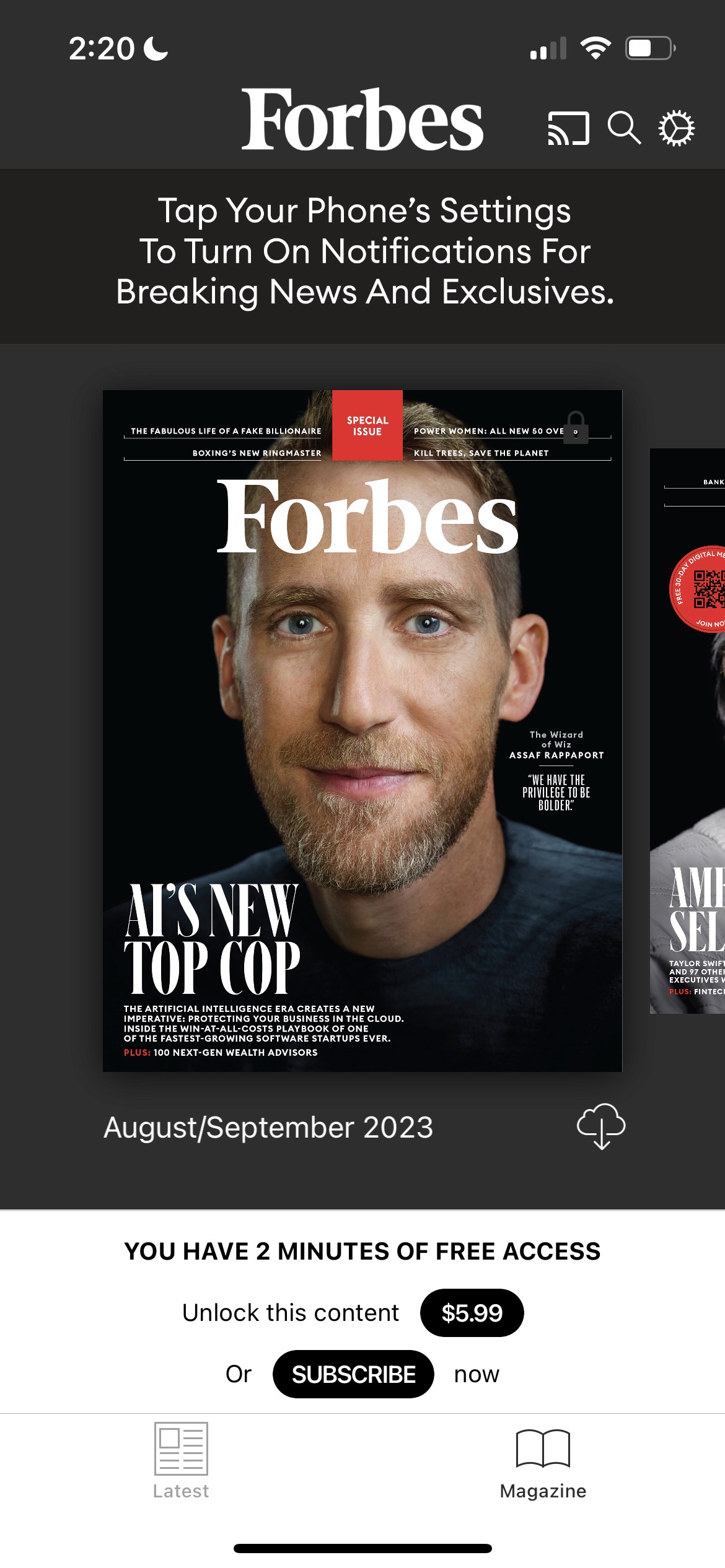
The magazine's accessibility issues, including the "3 min" timer, create confusion and pressure for quick decision-making.
Frequent notifications and pop-ups negatively impact Jackson's overall app experience.
Emotional State with Forbes
Content
Satisfaction
Engagement

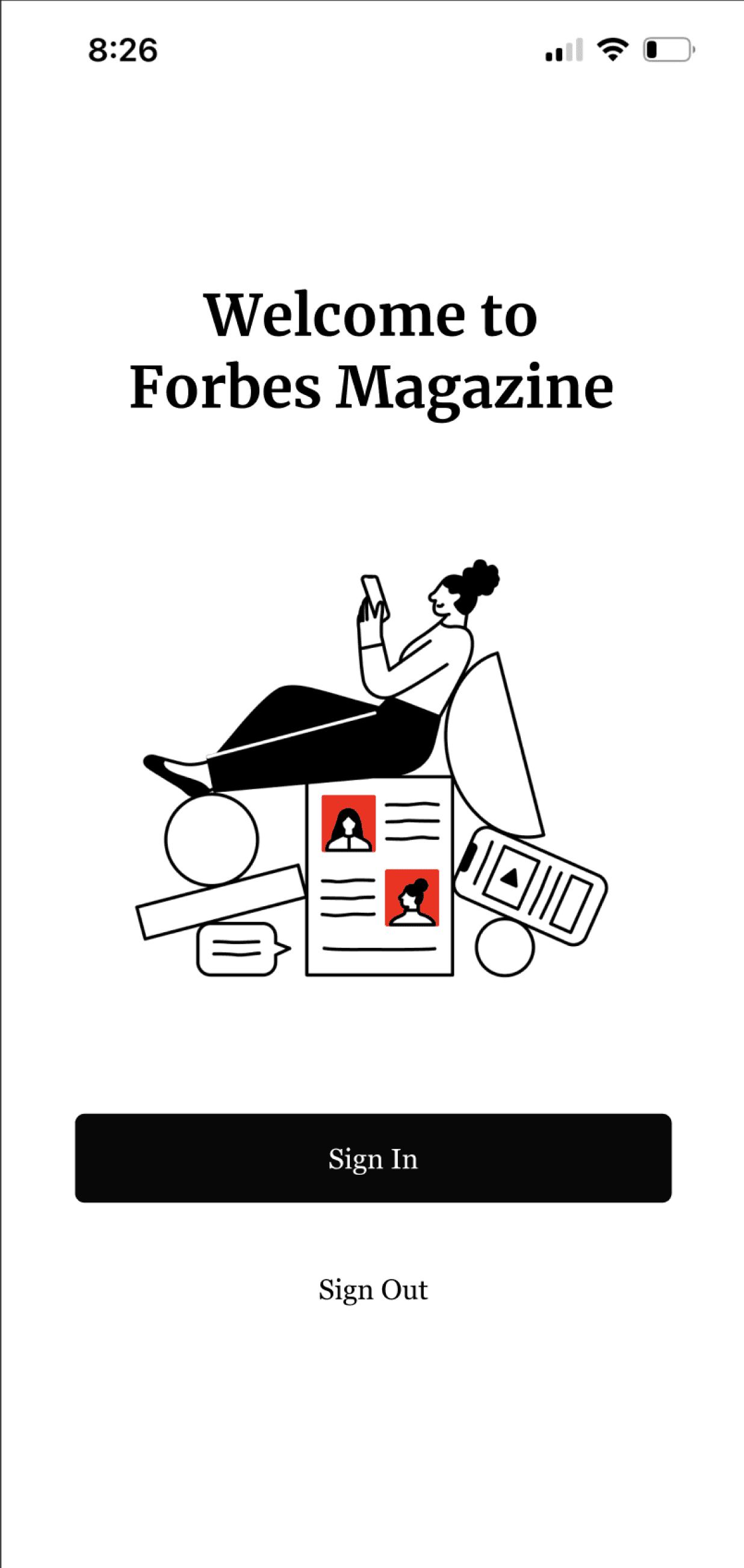
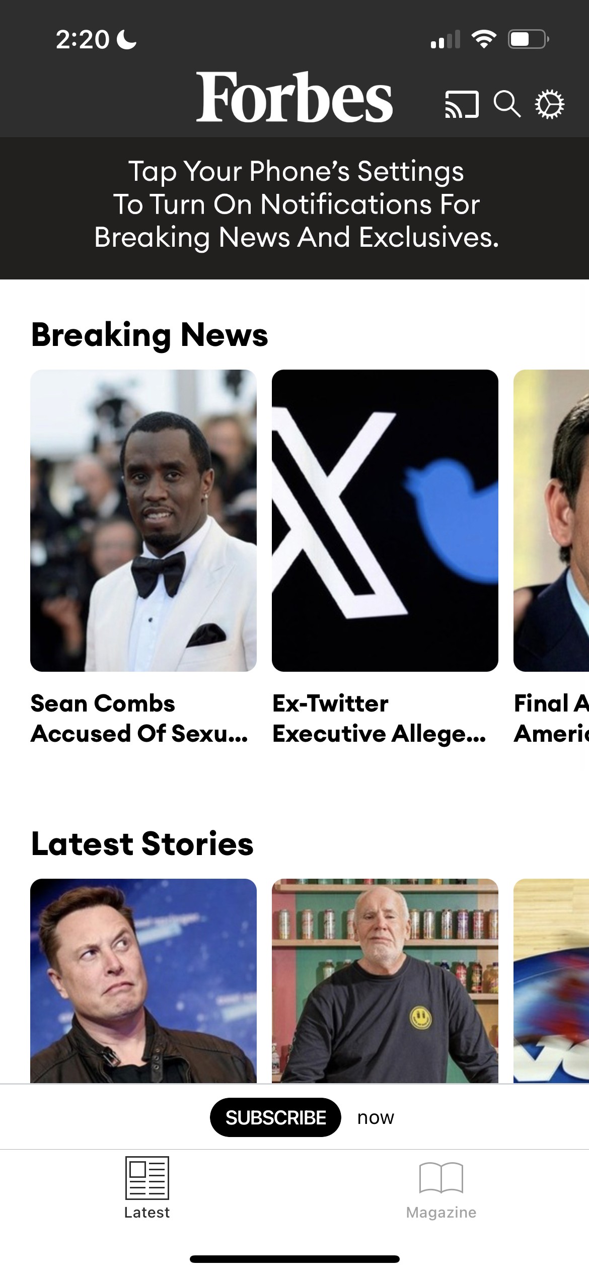
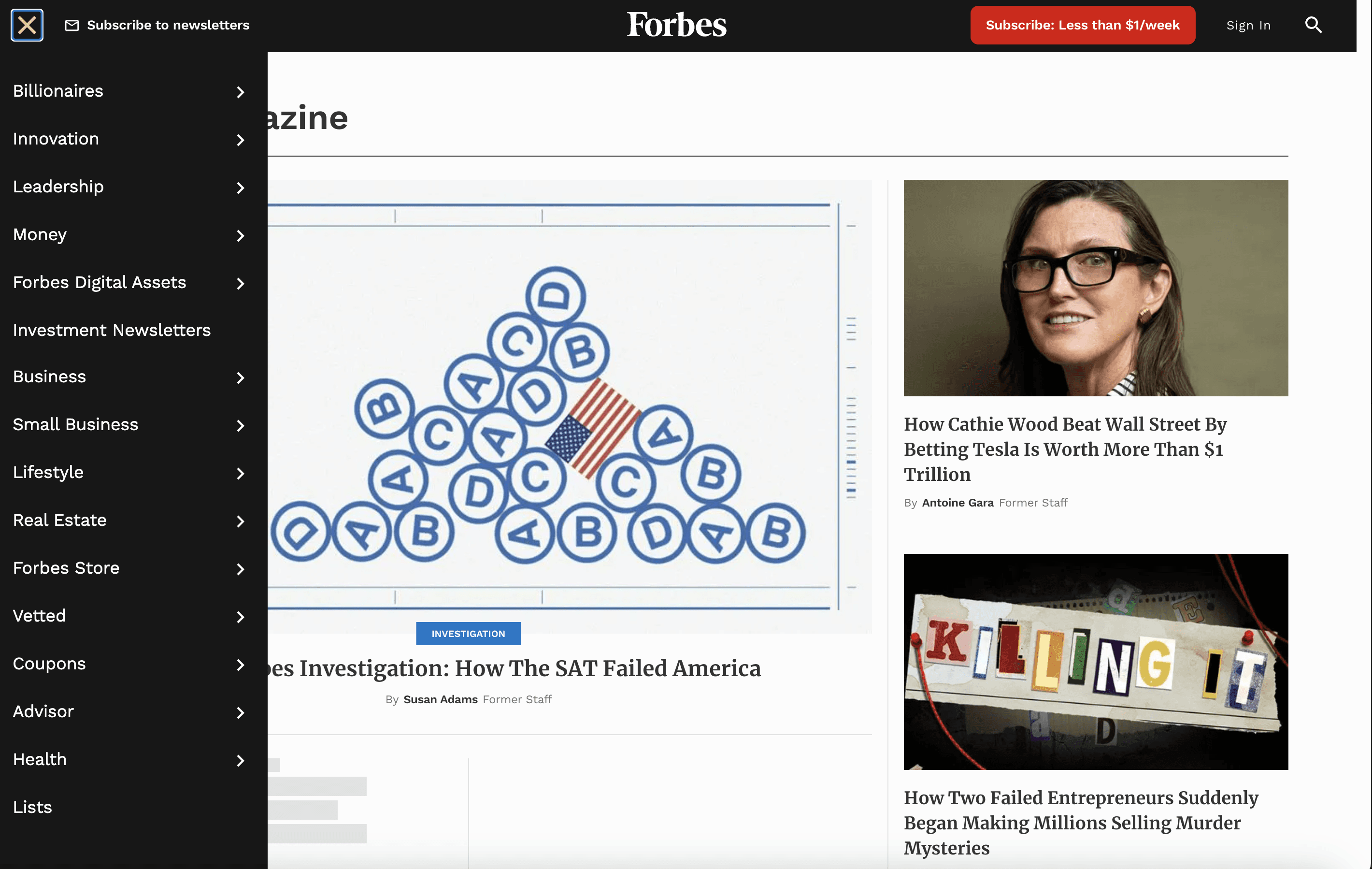
After identifying common pain points and developing strategies to address them, my solution involves designing an onboarding screen that enables users to specify their preferences and requirements from the start, ensuring a tailored experience. Given my emphasis on usability, a bottom navigation bar is crucial, highlighting sections such as News, Videos, Magazines, and Following. Additionally, a side navigation panel will be incorporated, granting users access to their profile, history, highlights, and settings.
Developing a Solution
IDEATION
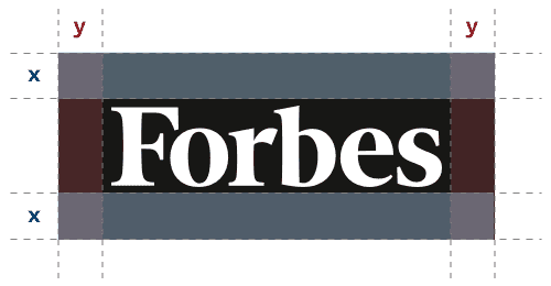
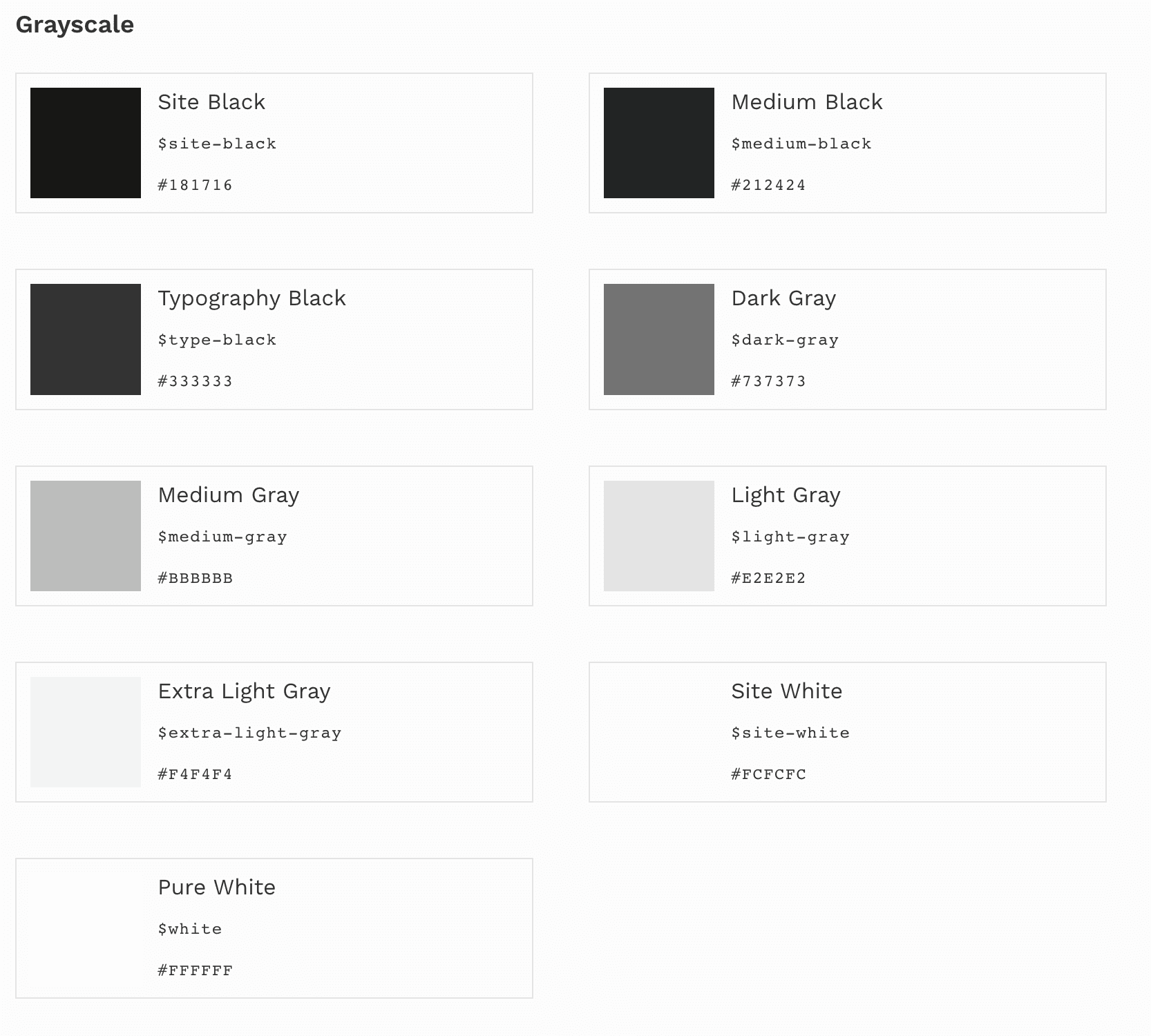
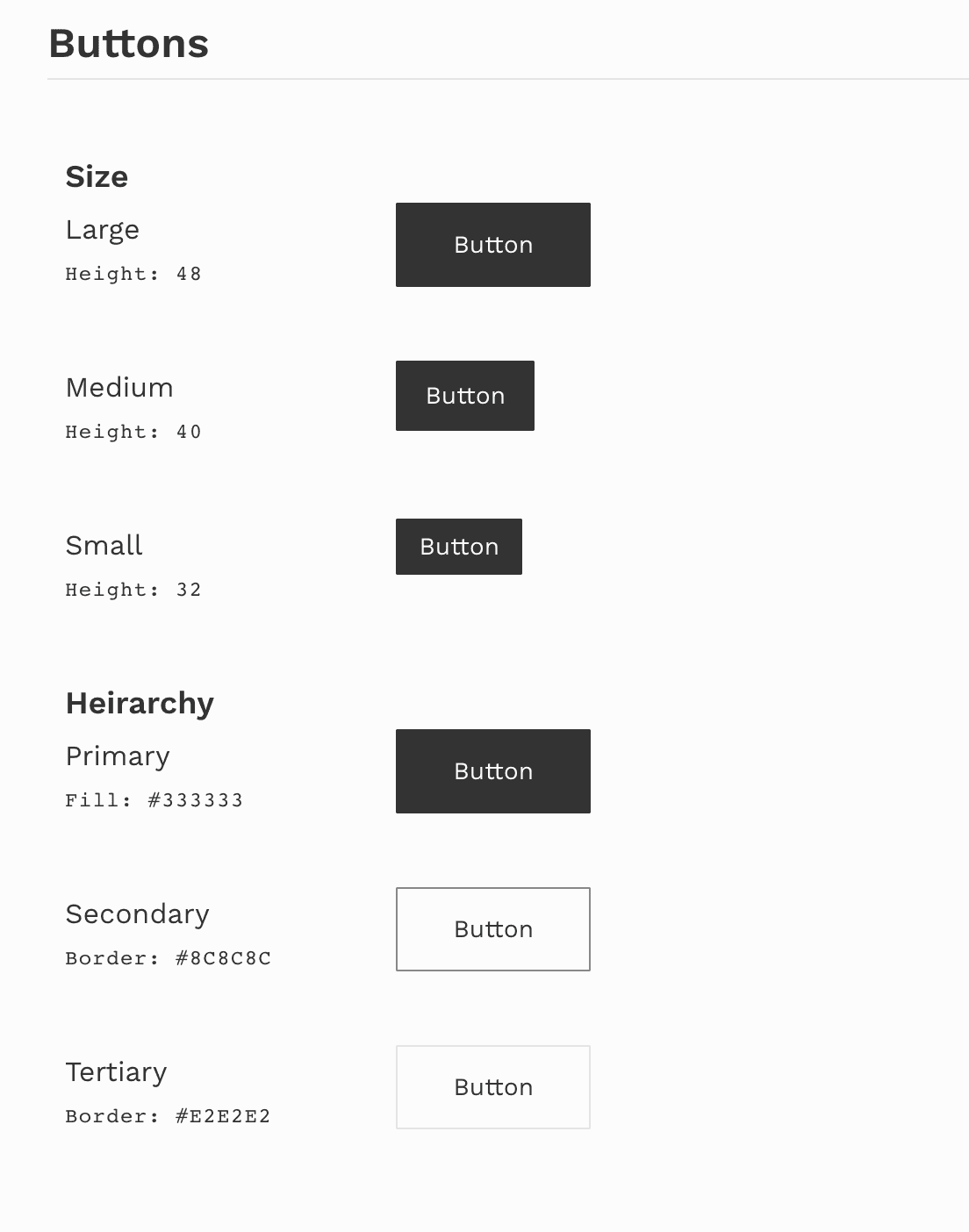
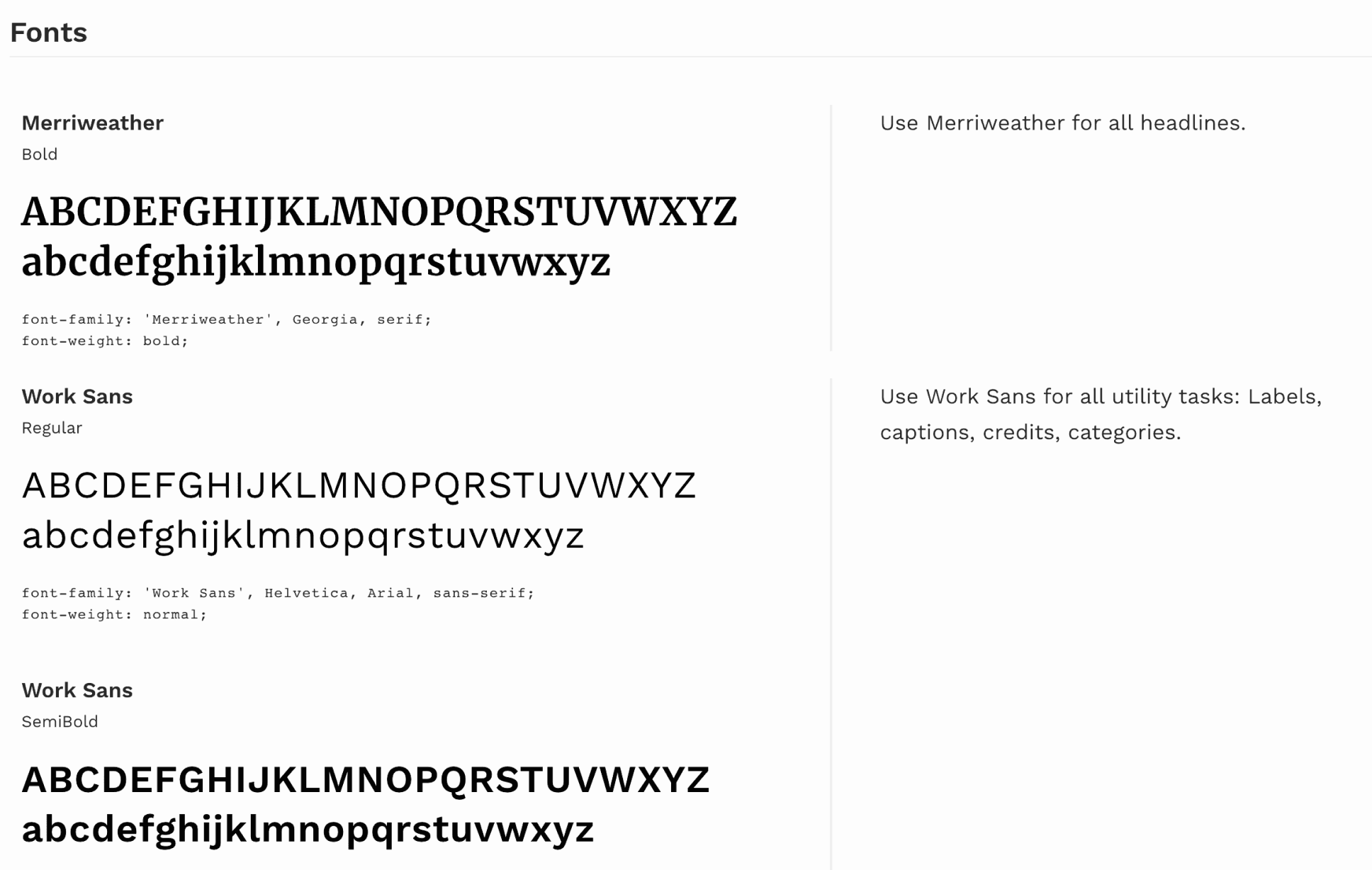
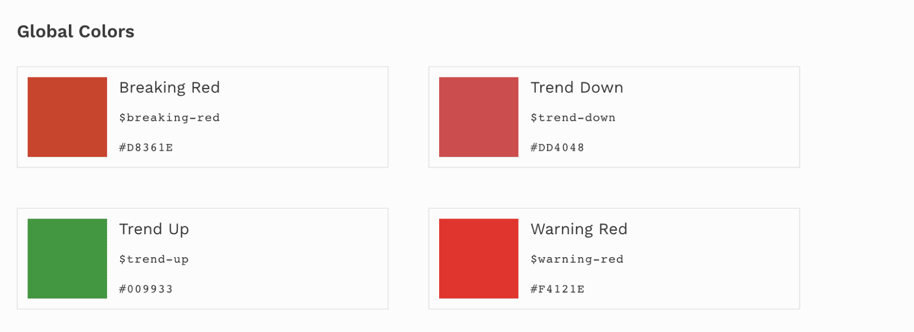
To immerse myself in Forbes’ identity, I examined their current style guide, which includes typography, color, and imagery. This will enable me to make usability changes while maintaining Forbes’ aesthetic.
Moodboard
IDEATION
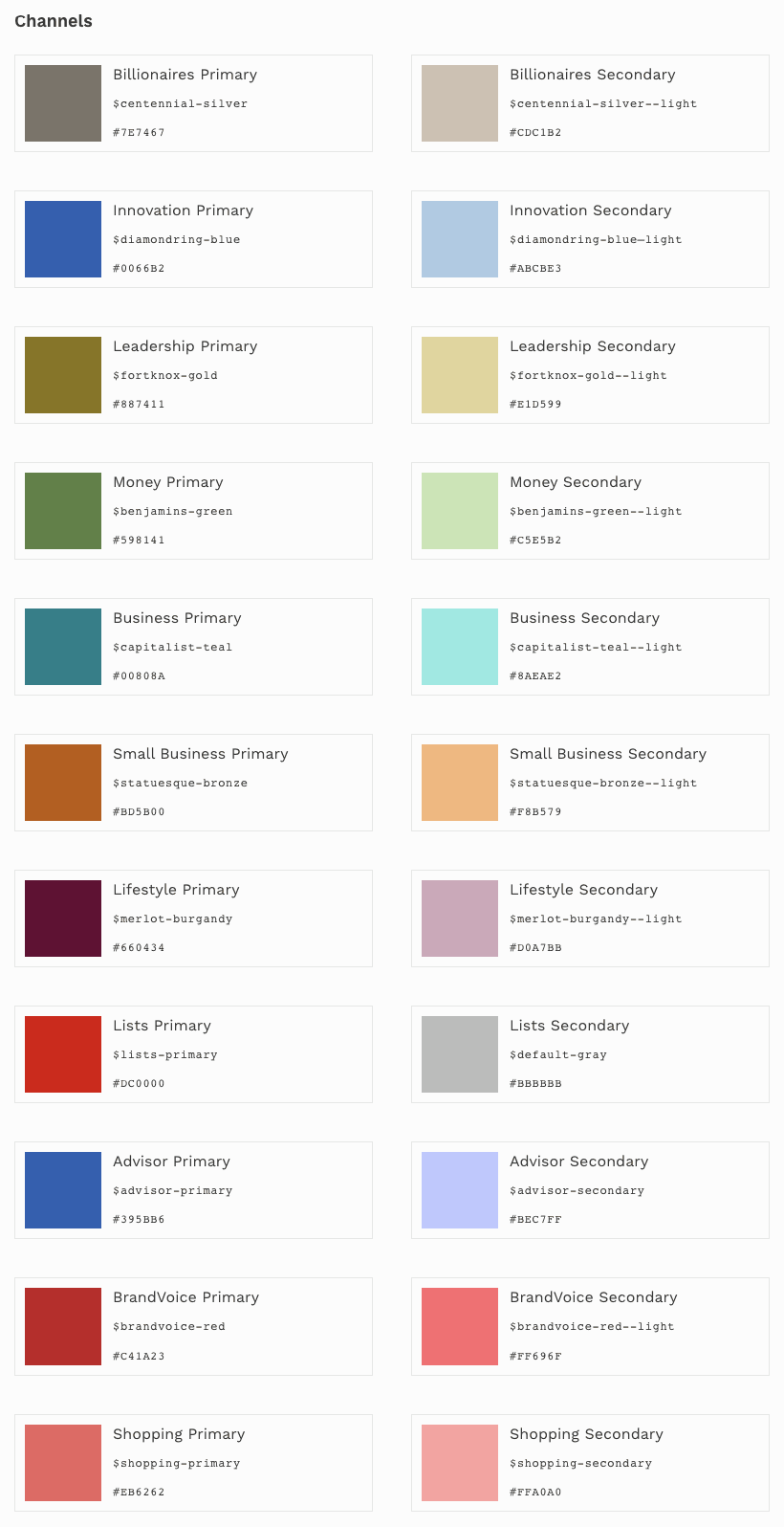
Forbes’ Color Palette
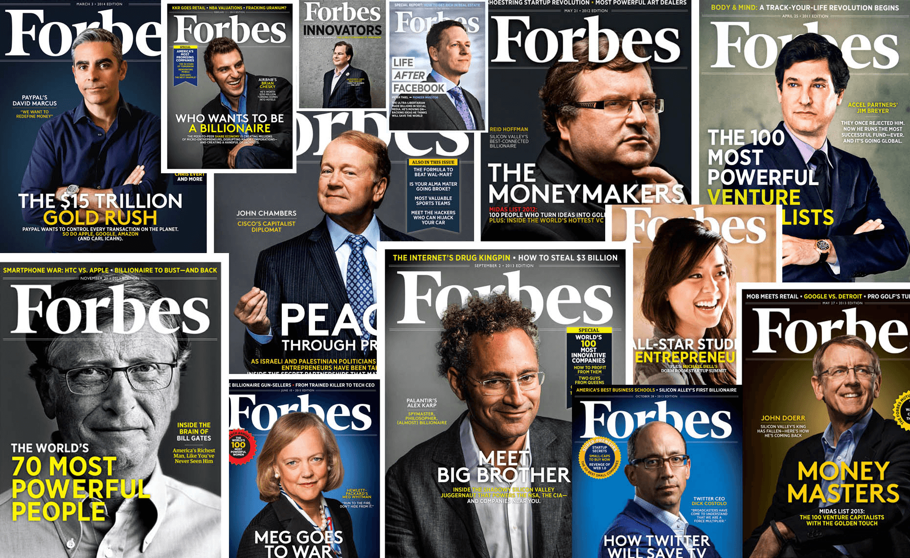
Image Style
Forbes’ Current Style Guide
Colors
After completing this case study for my Visual Design Studio class, I reflected on how much stronger I have become as a designer. I employed more technical techniques such as auto-layout, grids, and others, making my designs more consistent and structured. Additionally, I have grown as an interaction designer by practicing prototyping how users would realistically click certain buttons and anticipate their interactions. However, I believe the most significant growth for me was in my design thinking. I now approach design with a stronger focus on finding details for improvement and incorporating more UX thinking before diving into designs. I eagerly anticipate the next project I undertake!
Conclusion
REFLECTION
After conceptualizing a design direction, I began crafting mid-fidelity wireframes to visualize my intentions for the redesign. This primarily focused on the onboarding process and several other key features I aimed to incorporate.
Mid-Fidelity
IDEATION
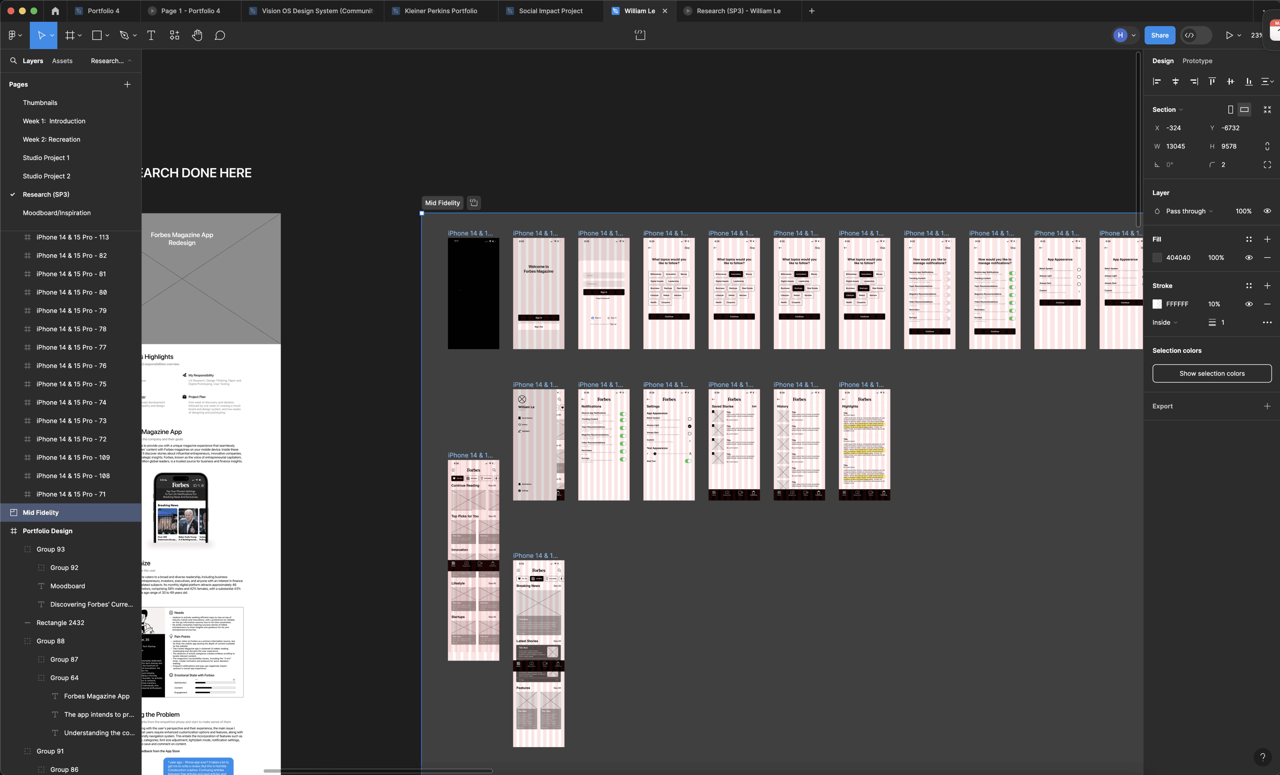
By creating an onboarding process, it allows users to customize their app experience early on, not only by selecting topics they like, but also by configuring their entire reading experience and notification settings.
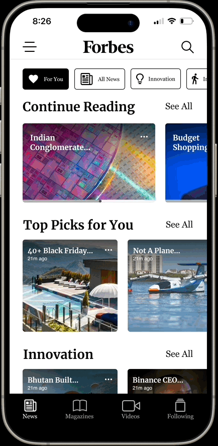
For the main screens, I added longer bottom navigation bars that better reflect the website. In my update, users have the same experience as before, viewing their magazines, but they can also see where they left off, watch videos, and easily change what they want to follow.
Final Prototype
FINAL DESIGNS
Onboarding
Main Screens
With the addition of a side navigation, you have easier access to your saved stories and history, while also having settings that can adjust your initial app settings. In my demo, I showed how you would be able to switch from light to dark mode in just a few simple steps.
Side Navigation