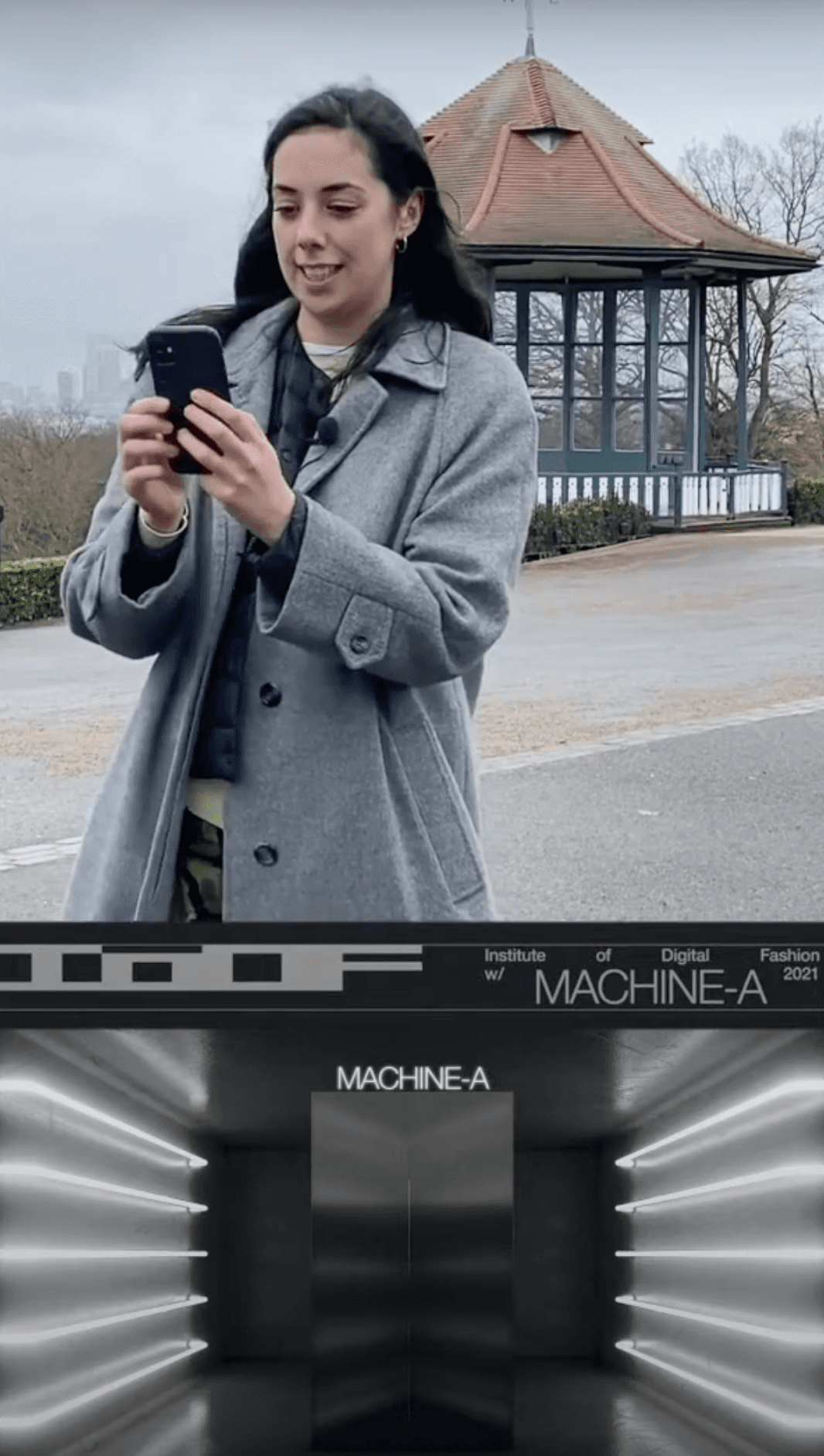
Visavis App Development
A walkthrough of my mobile app designs at Visavis.
Design challenge and responsibilities overview
PROCESS HIGHLIGHTS
Timeline
Nov 2022 - June 2023
Responsibilities
Tools
UX Research
UX/UI Mobile Design
Sketching
Figma
Adobe CS
Procreate
Slack
Web Data Design
Prototyping
User Experience Design
User Interface Design
Disciplines
Challenge
Design an app connecting digital devices with real-life experiences and social interactions.
Create a unique app, linking multiple brands to enhance user engagement and achieve business goals.
Opportunity
Our Vision
BACKGROUND
To provide some background on our vision, we believe that stores are evolving into social clubs. Through our app Visavis, we aim to facilitate a future where brands can accomplish several key objectives. These include acquiring new customers, fostering engagement through real-life events and experiences, incentivizing valuable actions with points, conducting surveys and polls, and cultivating genuine relationships within their store communities.
The Process
Research
Identifying Problems
Desk Research
Competitor Analysis
User Surveys
Synthesis
Persona
User Journey
Ideation
Developing a Solution
Moodboard
Low Fidelity
Mid Fidelity
High Fidelity
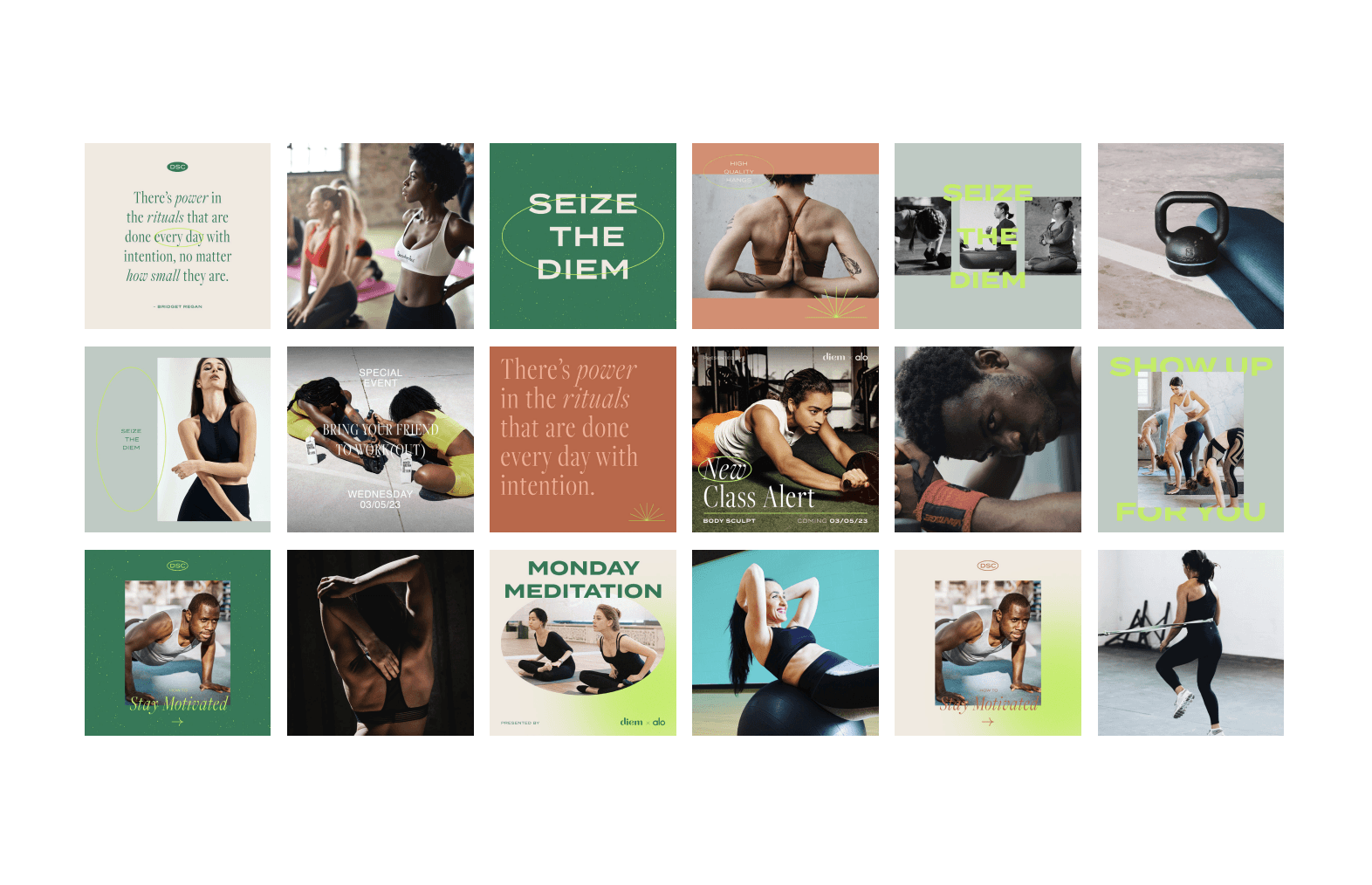
Final Designs
Design System
UI for Launch
Major Improvements
Reflection
Post Designs
Post Thoughts
1
2
3
4
5
Desk Research
RESEARCH
Before diving into designs, I wanted to first look at websites and articles from Google’s Search Engine that mentioned key statistics to be mindful of from both the consumer and the brand perspective.
User’s Perspective
Brand’s Perspective
Users have to search for events themselves
They can’t easily see if their friends are going to the events
They can’t find places or products that are within their interests
And they don’t get rewarded for sharing content from the brand’s event
There is platform fragmentation
Challenges with getting these events to new people
Challenges with event planning and coordination
And they can’t incentivize people who actually do come to the events
86%
of consumers are willing to pay more for a better customer experience.
80%
of customers are more likely to do business with a company that offers a more personalized experience.
75%
of consumers will favor a brand if there is a loyalty program that rewards members.
Competitor Analysis
Although our app is something that hasn’t been done before, we wanted to take a closer look at the companies that have attempted to enhance their in-person shopping experience, whether through integrating coffee shops or juice bars within their retail space or by hosting engaging events, and examine their levels of success or failure.
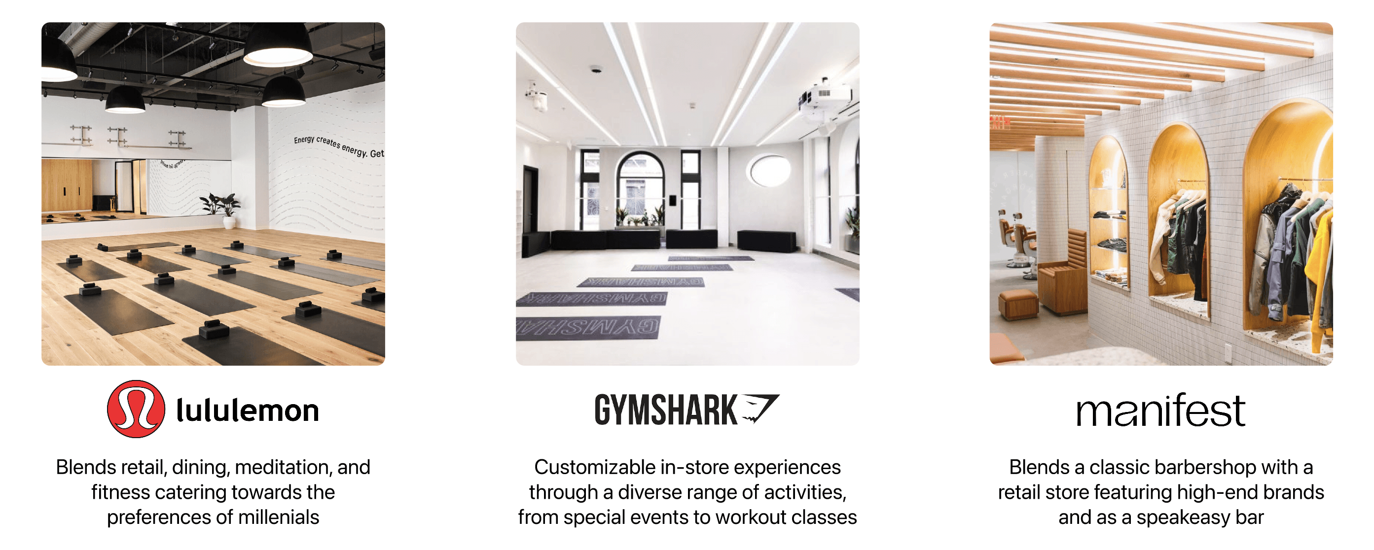
RESEARCH
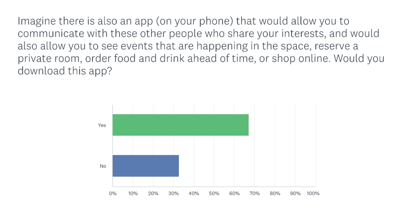
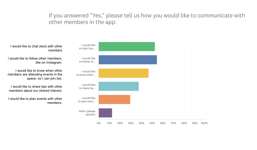
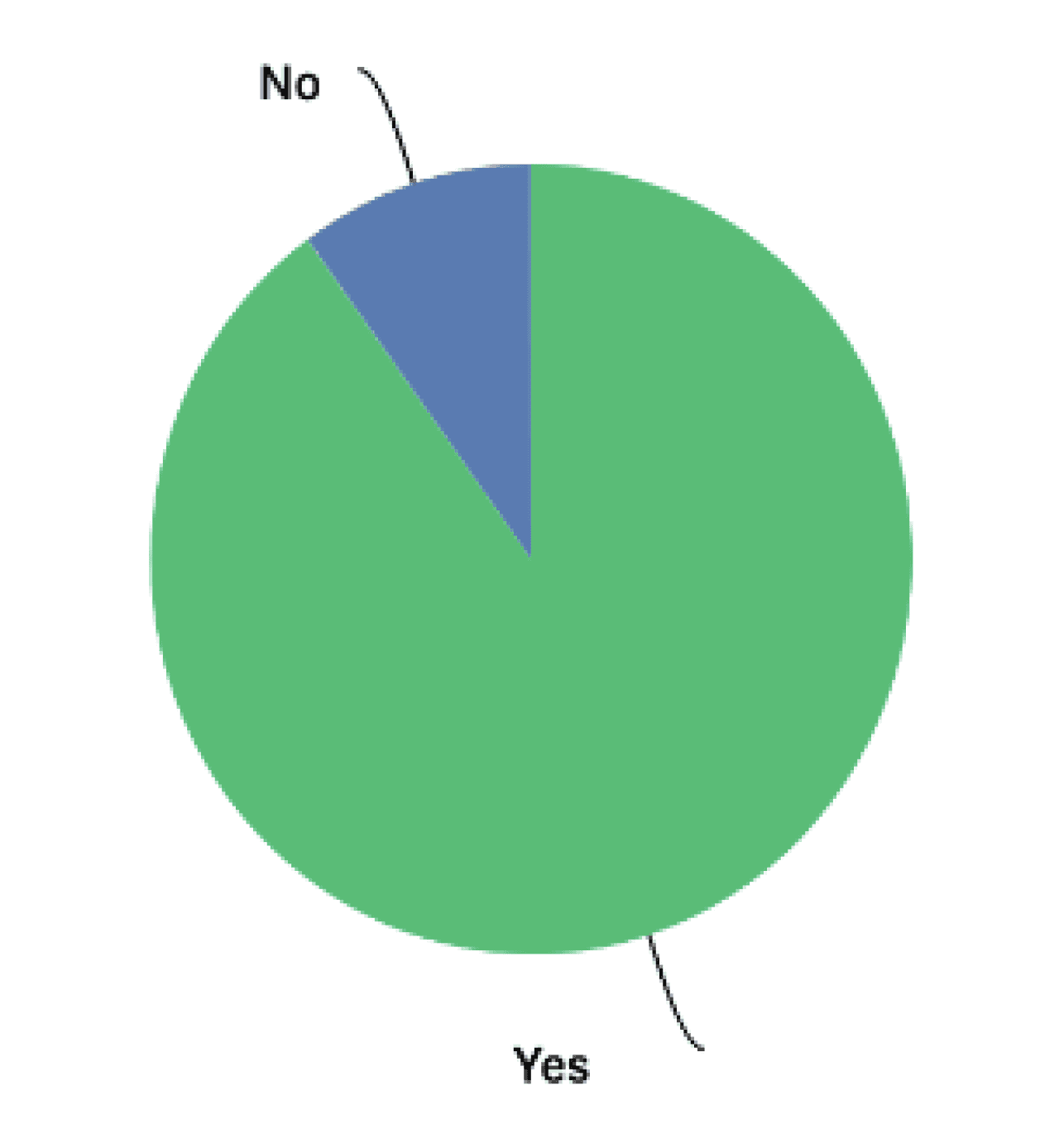
User Surveys
RESEARCH
Although our app is something that hasn’t been done before, we wanted to take a closer look at the companies that have attempted to enhance their in-person shopping experience, whether through integrating coffee shops or juice bars within their retail space or by hosting engaging events, and examine their levels of success or failure.
User Persona
SYNTHESIS
I wanted to create a user persona to embody the ideal Visavis user based on the full research process I conducted, incorporating insights from the problem discovery, user surveys, competitor analysis, and major pain points. By synthesizing the gathered data, my aim is to represent the user's preferences, pain points, and behaviors, allowing for a more focused and effective redesign for our ideal user.

A recent graduate student at the University of Maryland that wants to meet new people with similar interest as he never had a chance to find new friends in the real world due to COVID-19 and remote work.
Frustrations
Jackson Miller, 24
Junior SWE
CS Major
Washington D.C.
Emotional state during the process
Content
Satisfaction
Engagement
Discovering places to go
Not feeling welcomed
And how much time he has wasted
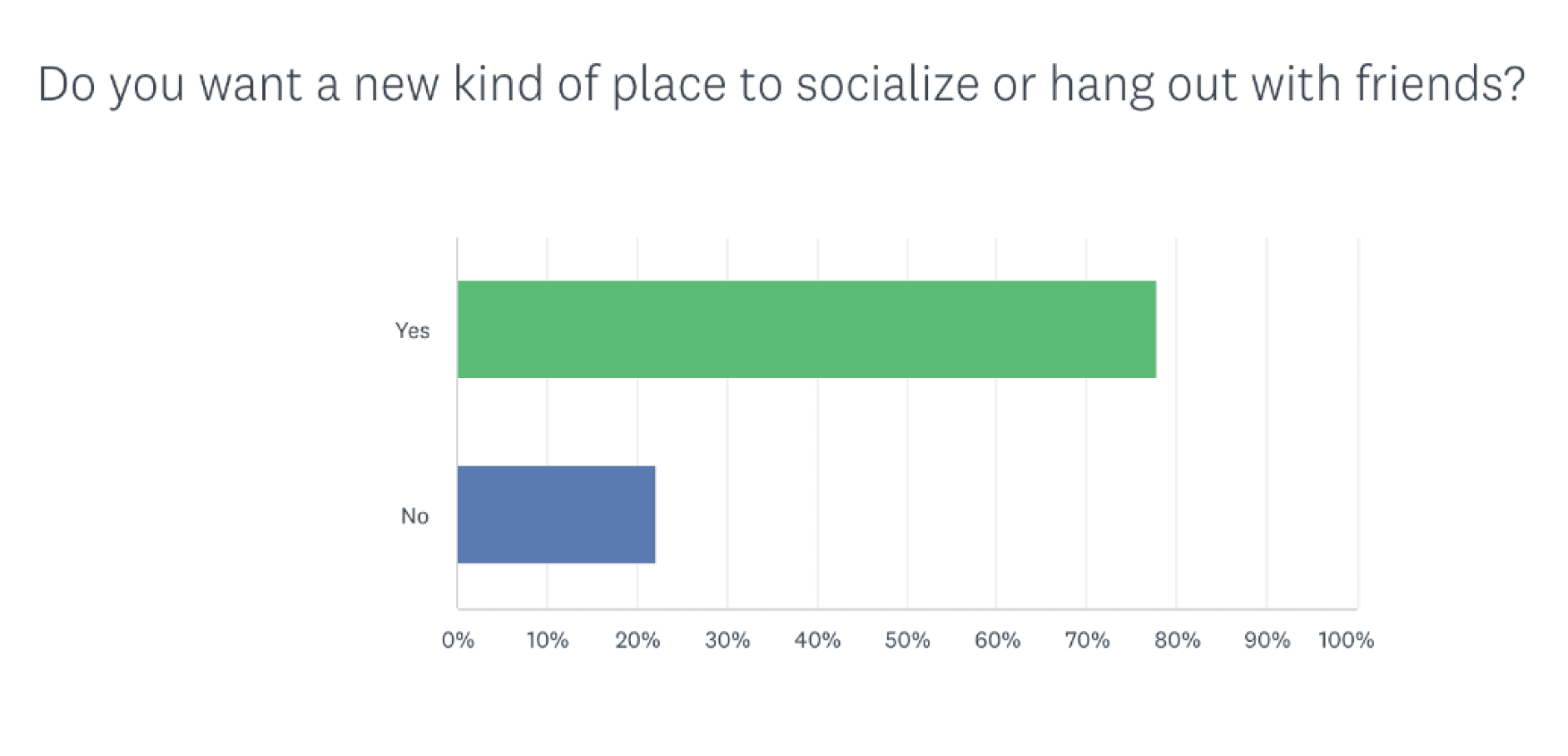
60%
of people in digital communities want more places to meet IRL
81%
of Gen Z prefer to shop in stores vs online. They see it as a social excursion.
Digital targeting will become even more difficult and expensive. Brands will continue to turn to new marketing channels, like brick-and-mortar and pop-ups.
80%
of brands matched or exceeded their pre-pandemic spend as Brands are investing in experiential marketing
60%
of consumers expect more space in retail stores to be devoted to experience rather than product by 2025.
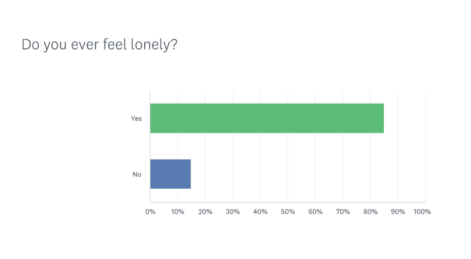
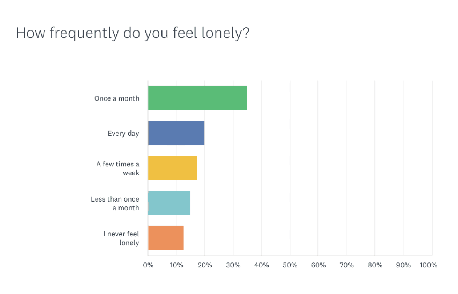
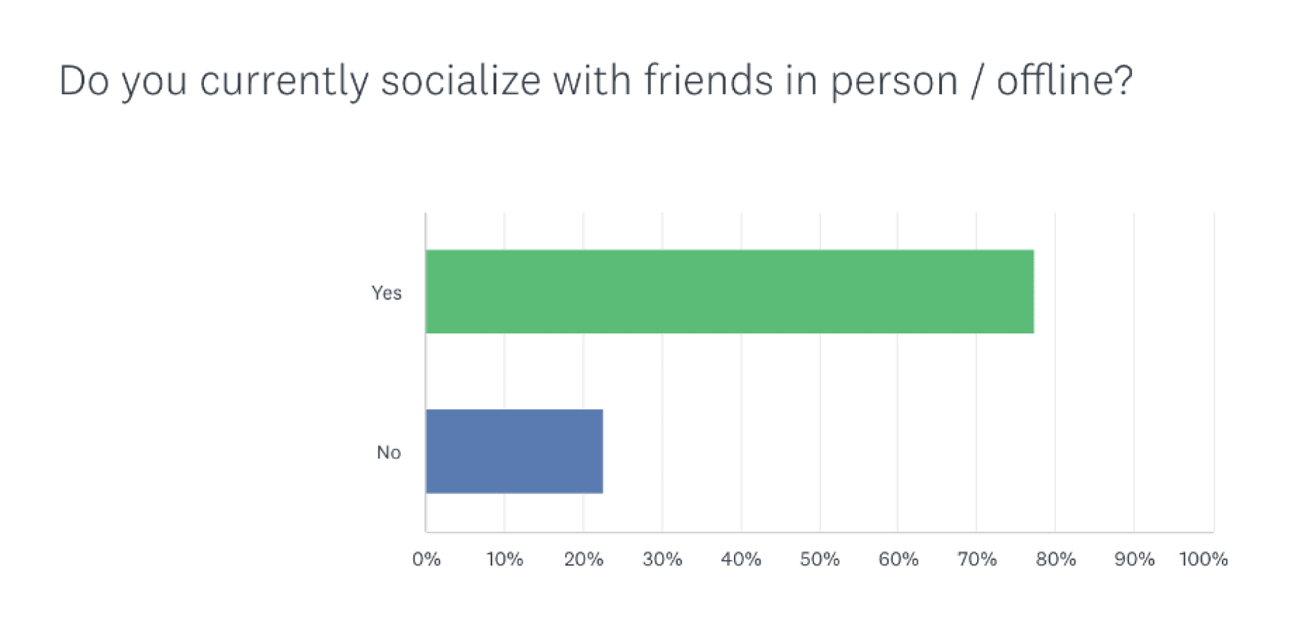
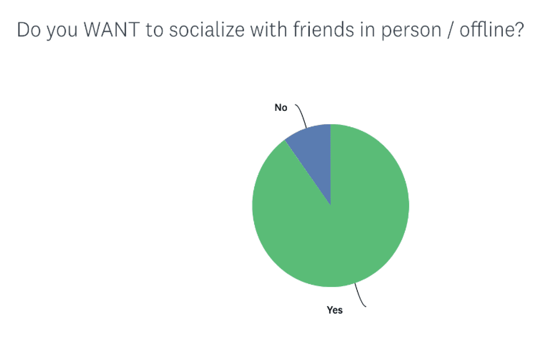
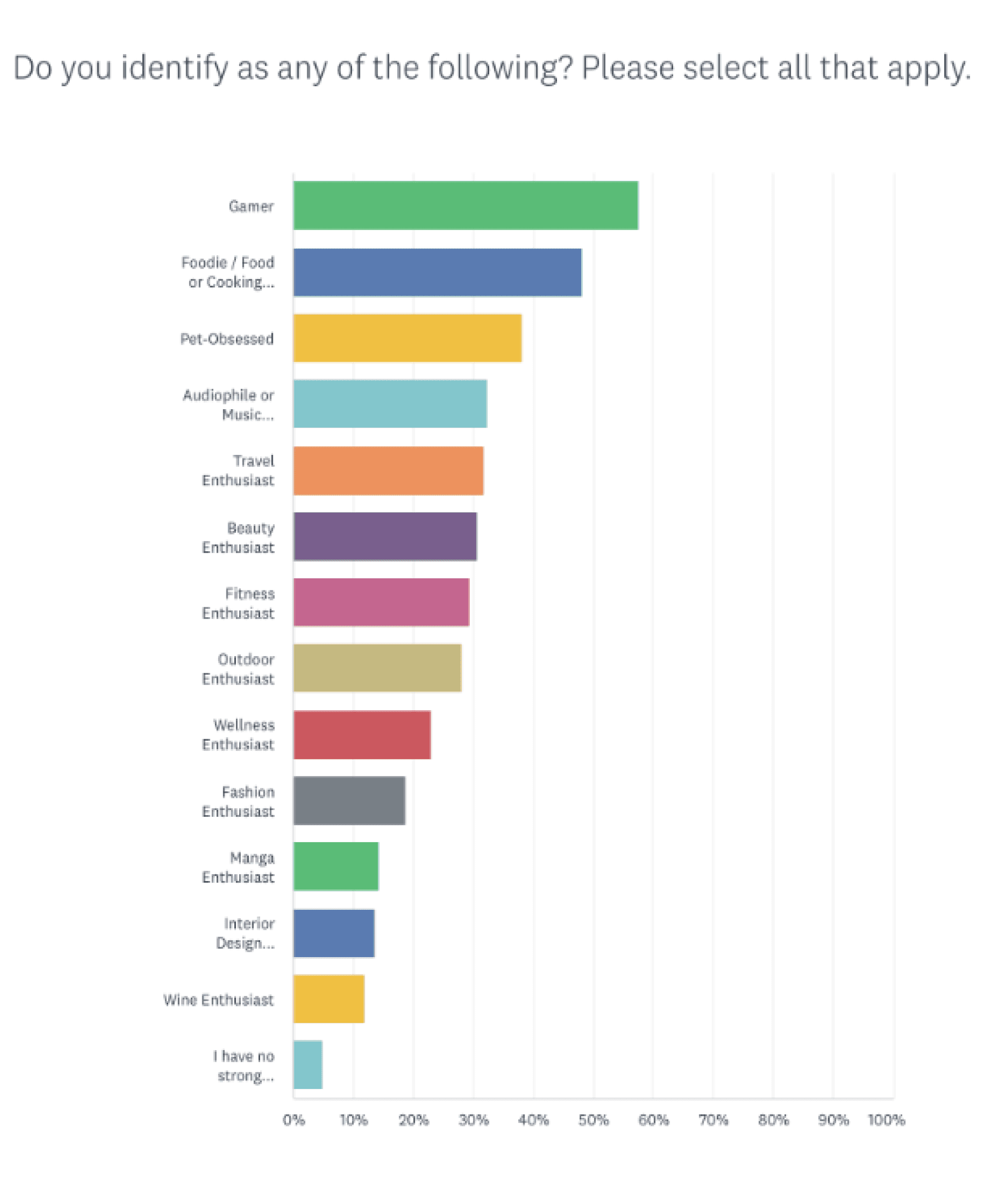
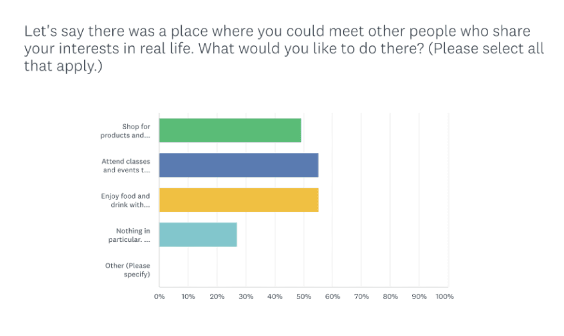
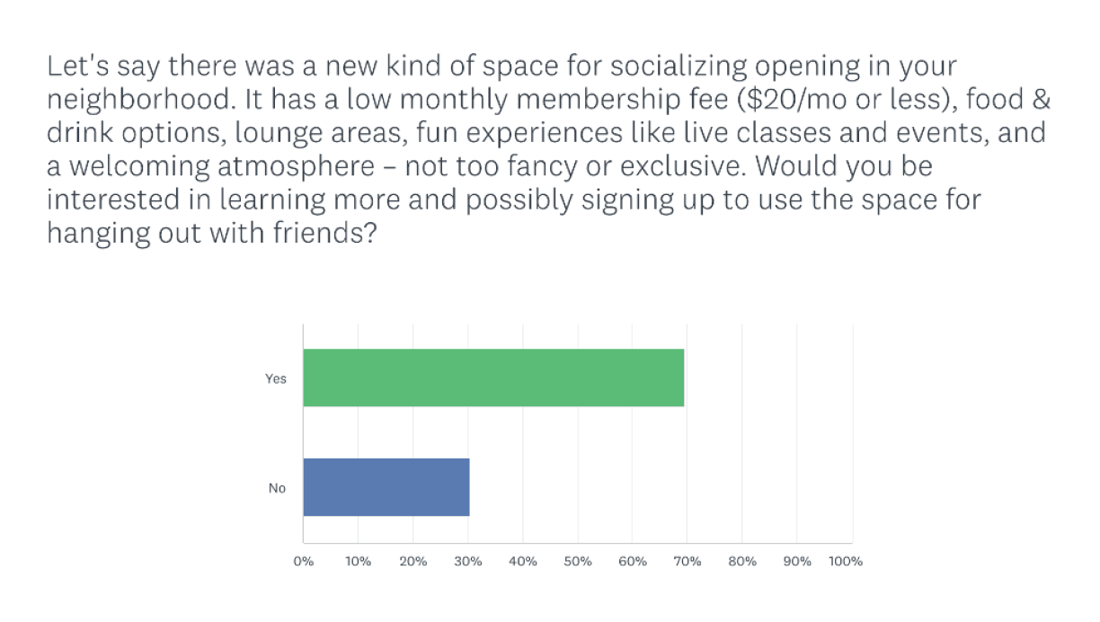
And after these 500 surveys, we can conclude that:
User Pain Points
“It’s time to put in some effort”
“This isn’t so bad”
“I don’t feel like it’s working”
“I give up”
Goes to local coffee shops, bookstores, and sneaker stores to find common interests
Eventually “doesn’t feel right” anymore and wants to start ignoring this issue
With this poor experience, he ultimately gives up this idea entirely
Starting
Trying
Conflicting
Quitting
Scenario: wants to meet new people with similar interests
Jackson Miller
Decides to find some time to meet new people
I created a user journey to map out how Jackson, our ideal Visavis user, would navigate his current situation, aiming to understand the highs and lows of his emotions while trying to meet with new people in person. This comprehensive visualization provides valuable insights into Jackson’s experience, enabling a targeted redesign to optimize user engagement for brands and satisfaction for users.
User Journey
SYNTHESIS

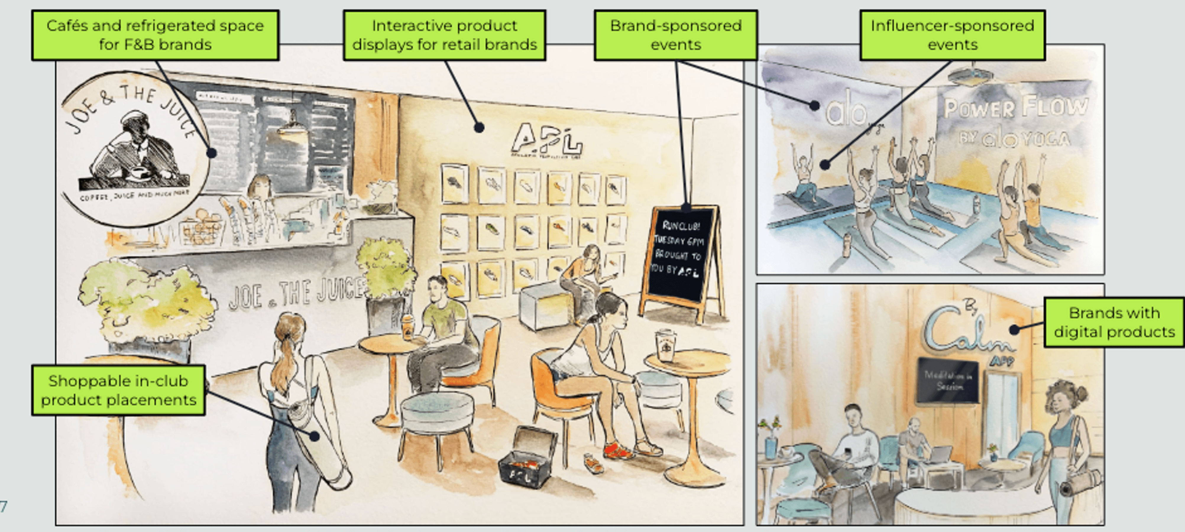
With Visavis' technology, brands can open shoppable social spaces. This means that within the Visavis app, brands can offer their niche communities a venue for gathering, curated shopping and events, and more, ultimately leading to the highest quality in-person experience.
Developing a Solution
IDEATION
Redesign Goals:
Help new customers discover you without the expense of digital ads.
Incentivize return visits and engagement with points & rewards.
Host in-store events with greater reach and stronger ROI
Learn about your community through surveys and generate revenue-driving loyalty
Message your customers with the content they’re most likely to engage with.
Moodboard
IDEATION
Augmented Reality (AR) Concept
Color Inspo
Original Logo and Font Design
Original Logo and Font Design
Spotify Categories Inspo
Dribbble Inspo

NEW
LOGO
Following the User Flows, I delved into researching mobile apps and websites renowned for their exceptional user experience and user interface design. This research served as a valuable resource for my ideation process, as it enabled me to generate ideas based on designs that have successfully delighted users. Additionally, it helped me identify essential elements that should be included in the app, as well as discern what features may be unnecessary.
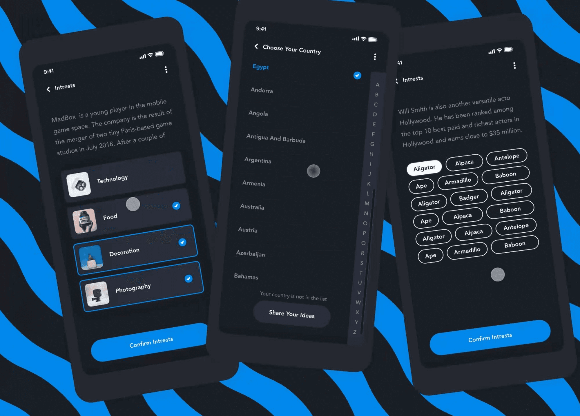
Low-Fidelity
IDEATION
Here are some of my initial thought processes regarding our research and the goals for our app. The low-fidelity designs provided us with the first glimpse of how our app could potentially work, with all the key functionalities implemented.
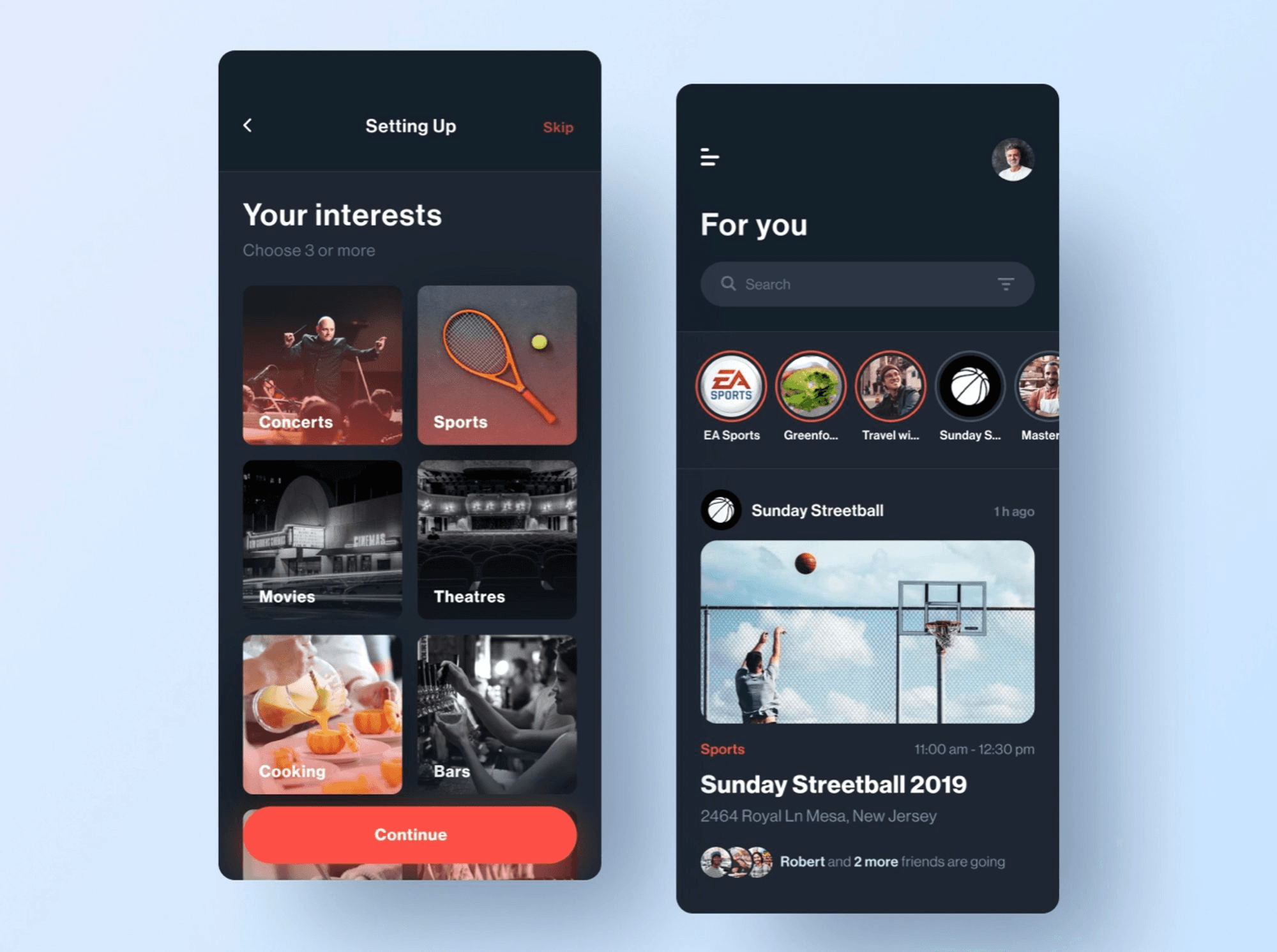
Mid-Fidelity
IDEATION
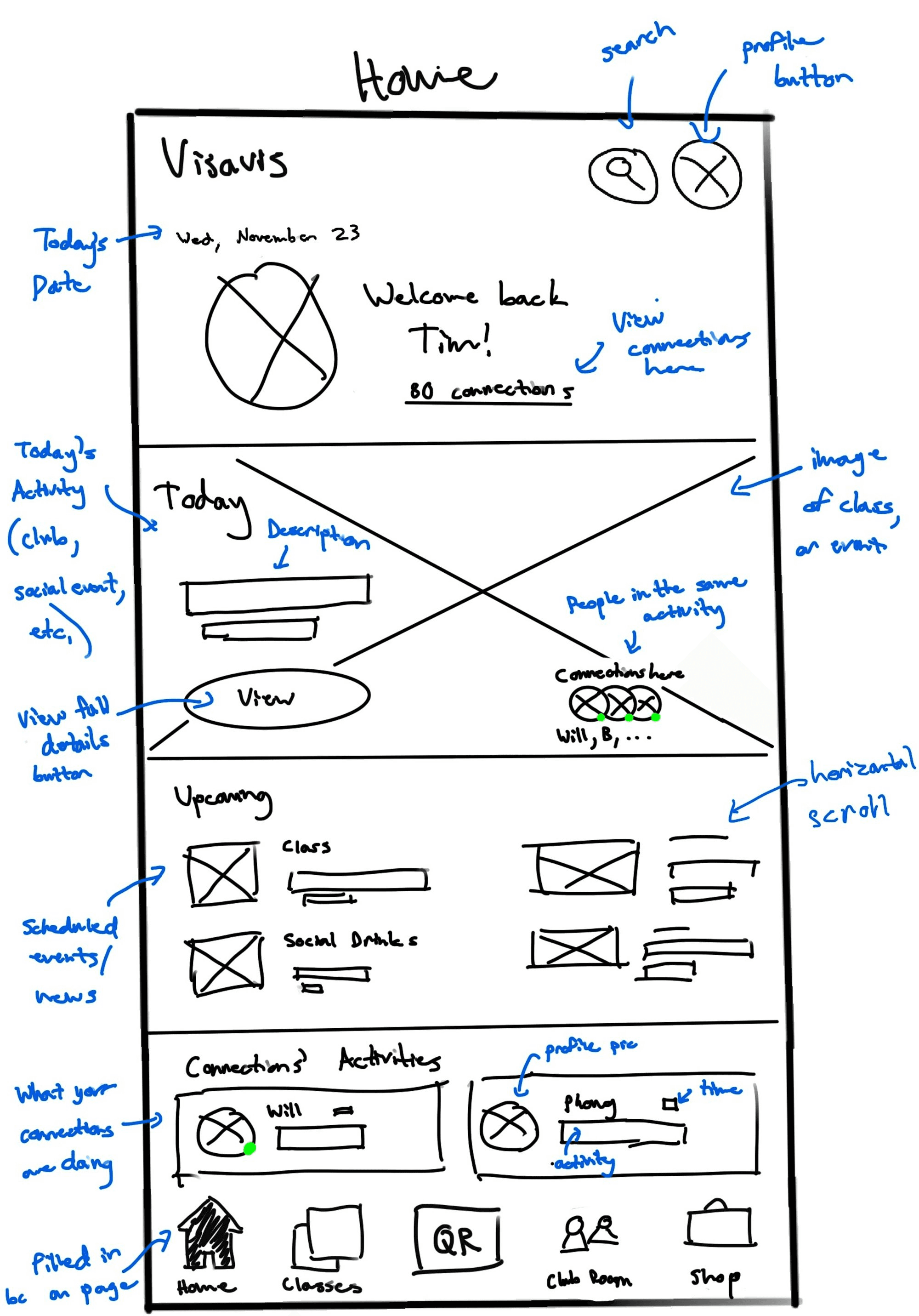
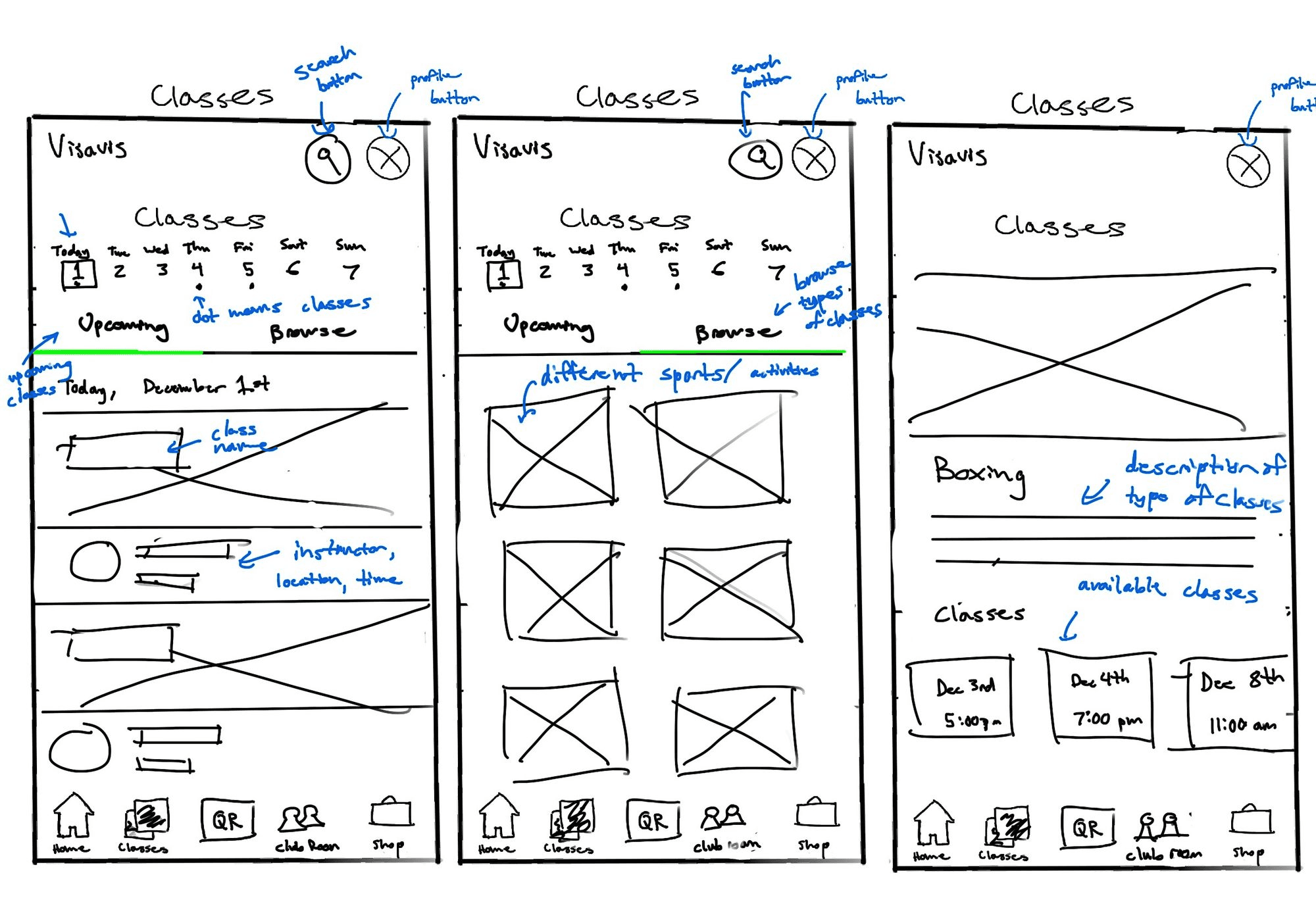
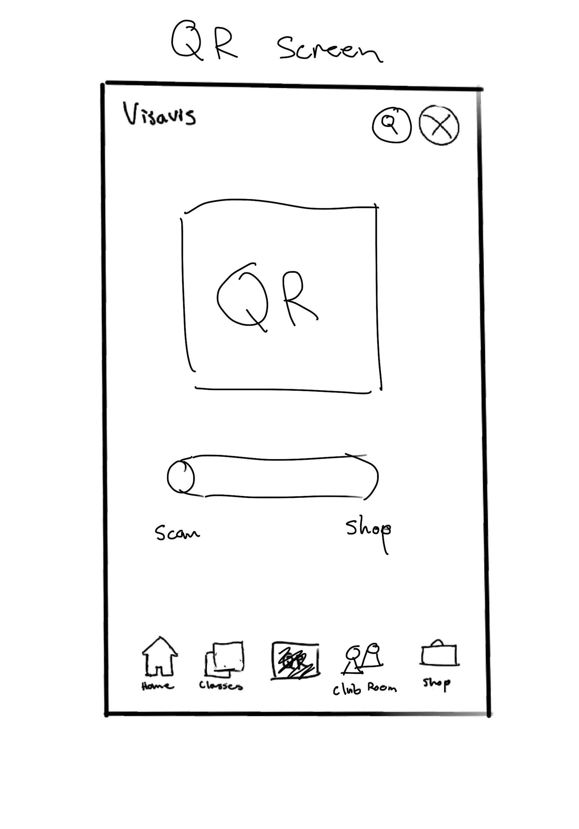
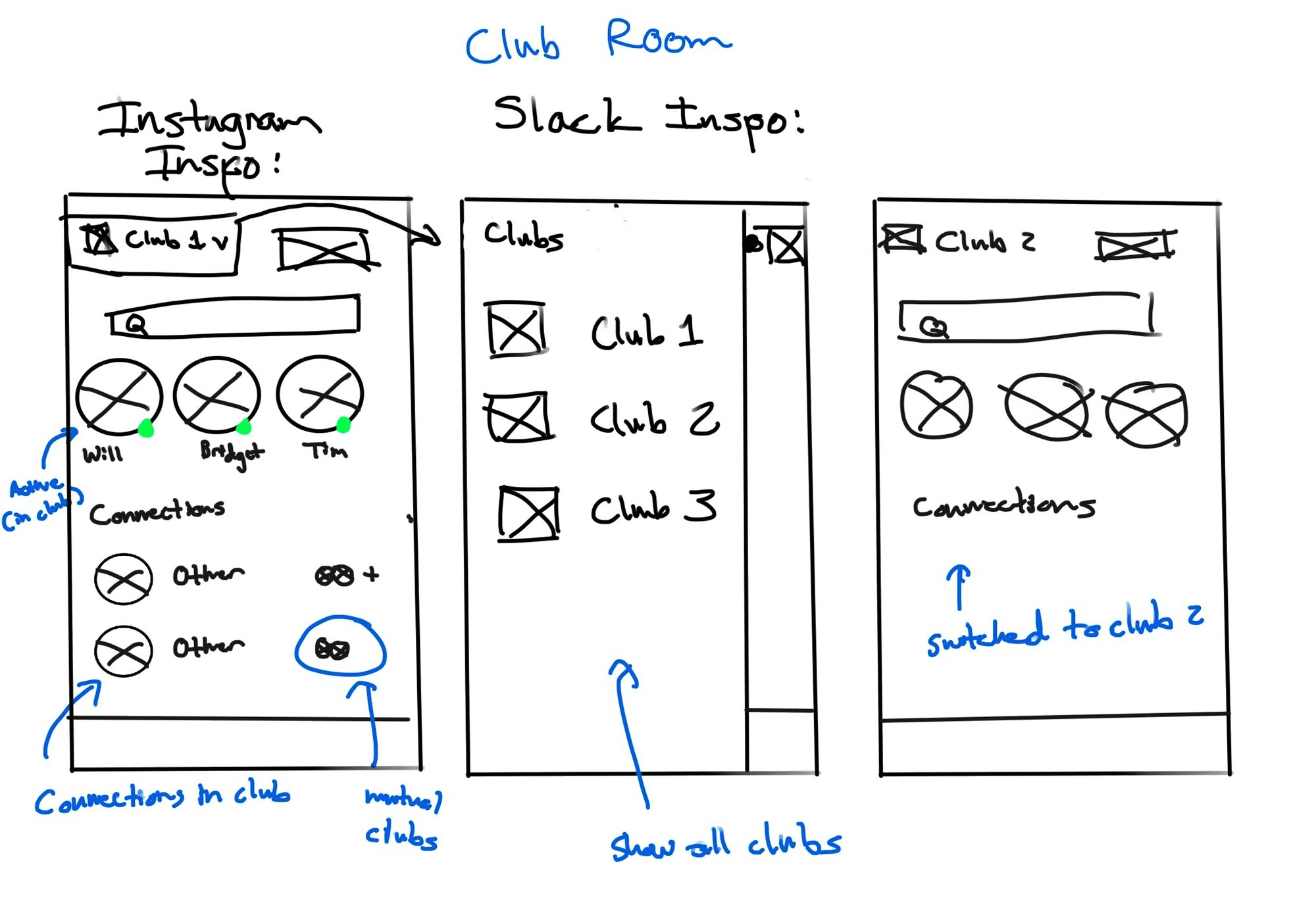
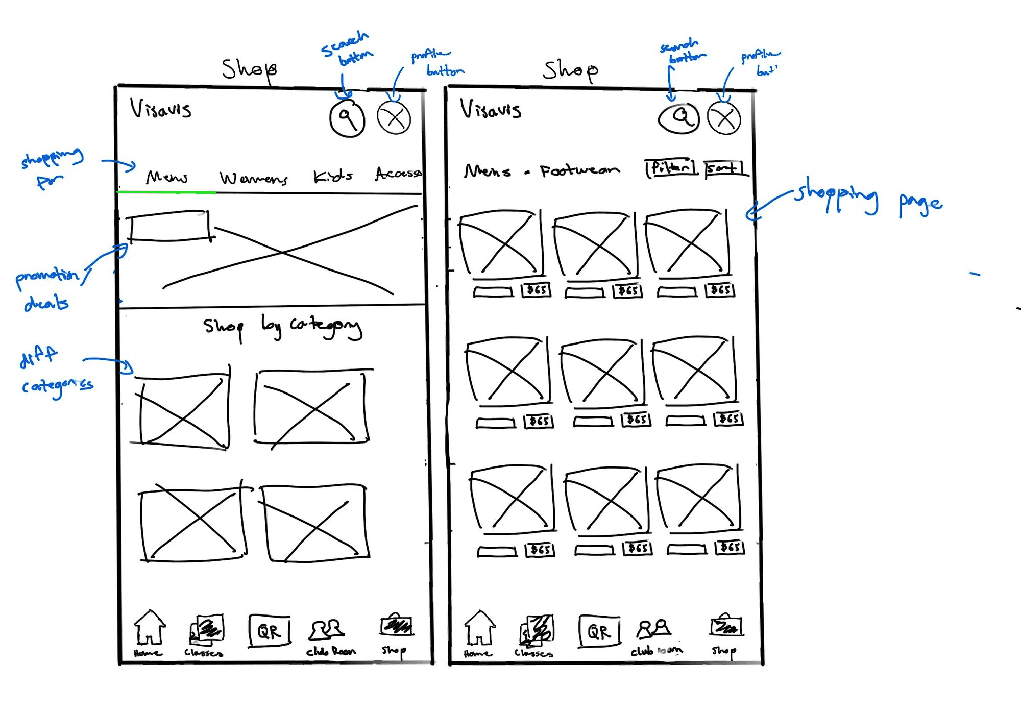
Our "Ugly Duckling" stage was dedicated to ensuring that the UX of our app aligns with the users' needs in terms of usability and functionality. Here are some of the wireframes:
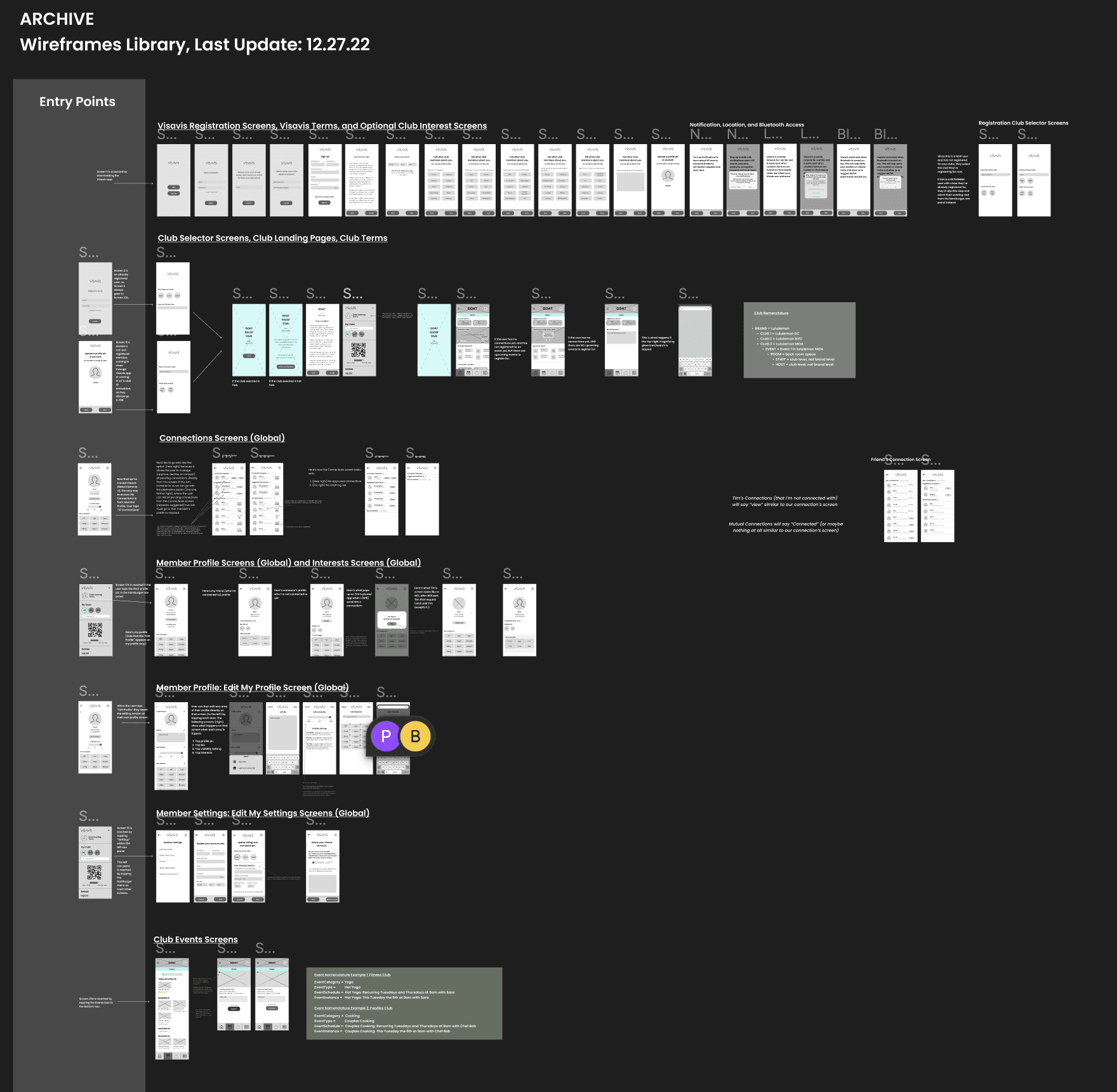
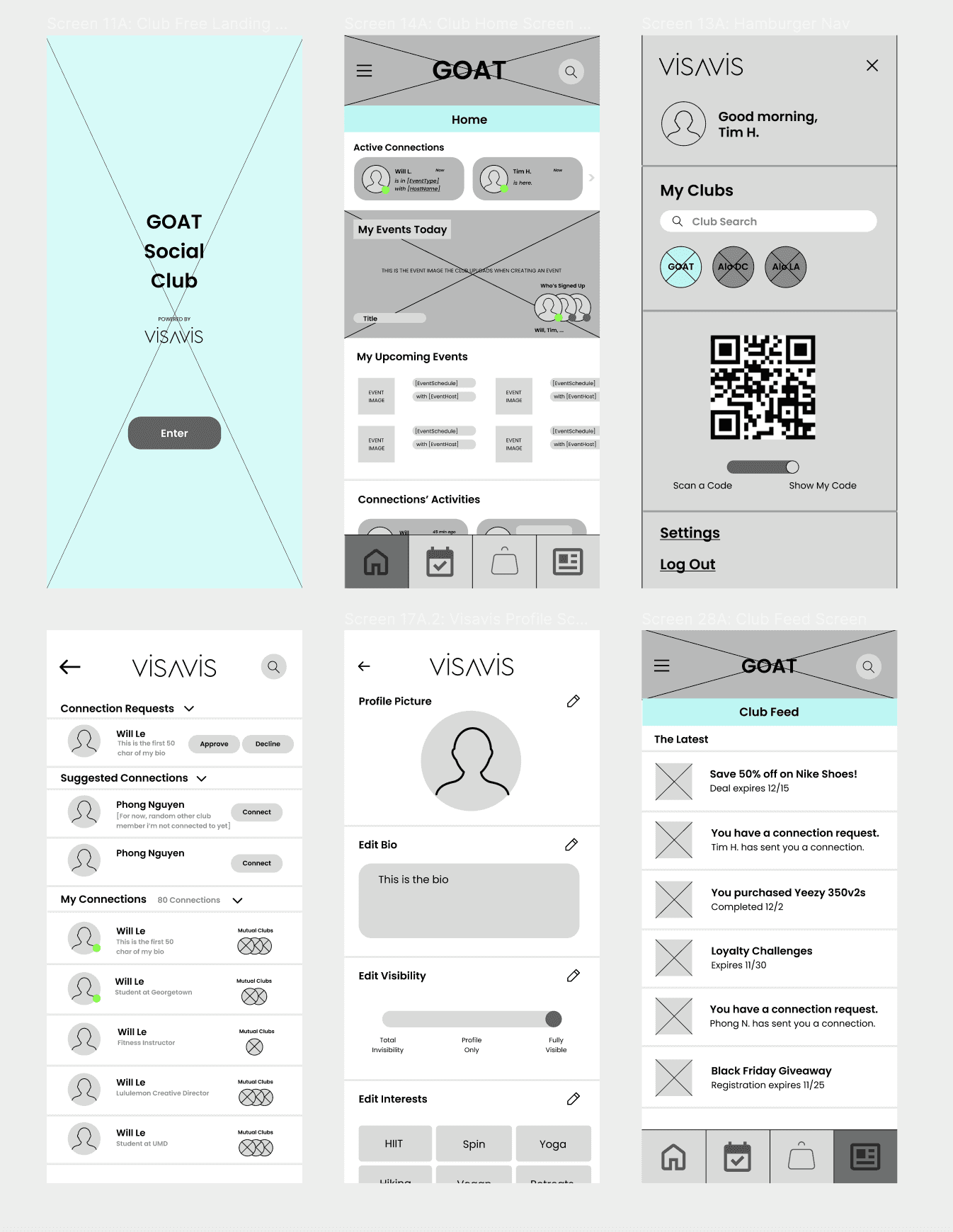
⚠️ These are only 1/4 of the medium-fidelity wireframes
My Key Takeaways
It is always important to understand who your target audience is
Taking inspiration from other companies is okay
How time consuming the wireframing process is
Understanding physical components
Next Steps
Onboarding new users to Visavis + Conducting more early-stage user testing
Conduct second round of user interviews and surveys
New experiential features (specifically AR)
Understanding physical components
Post Designs Outcome
REFLECTIONS
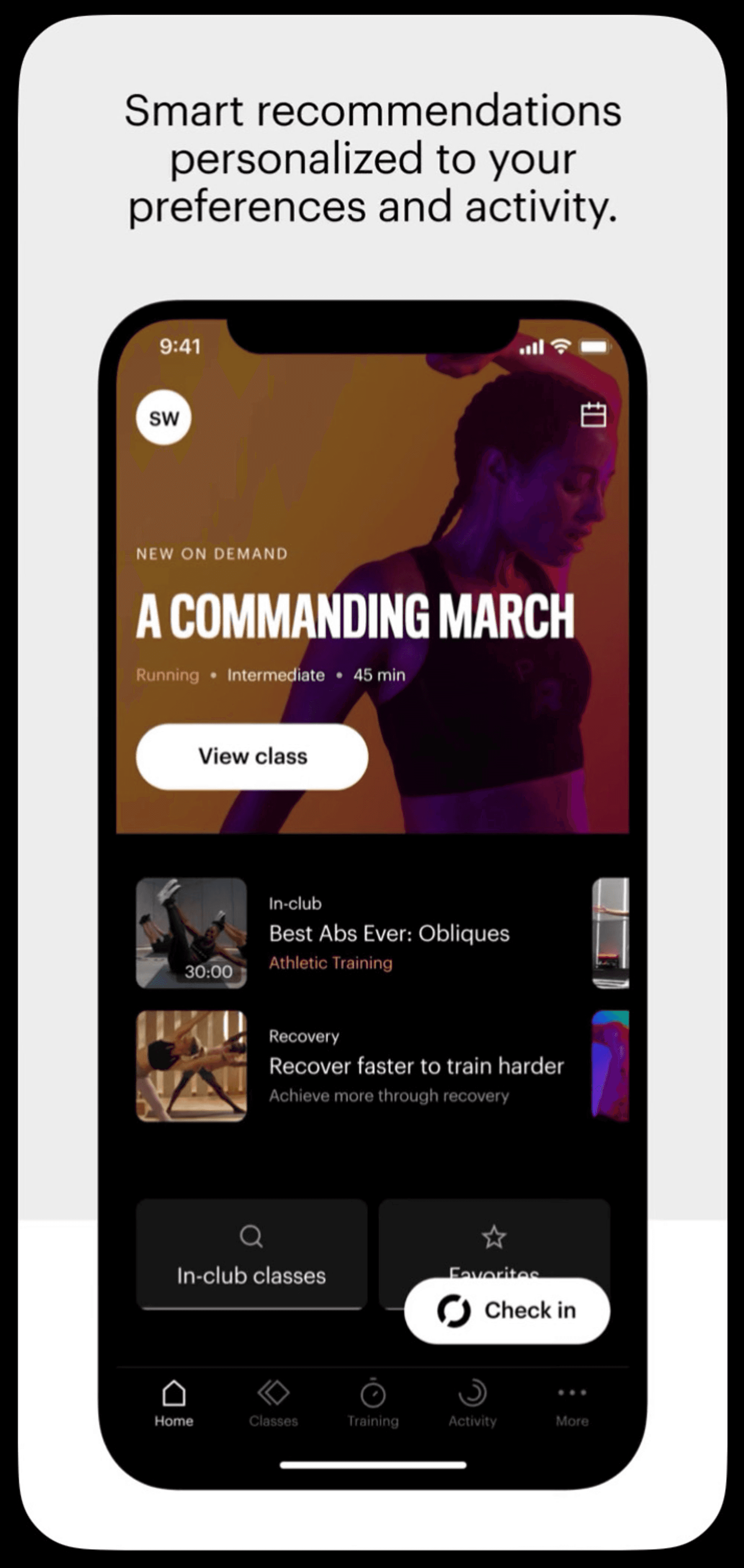
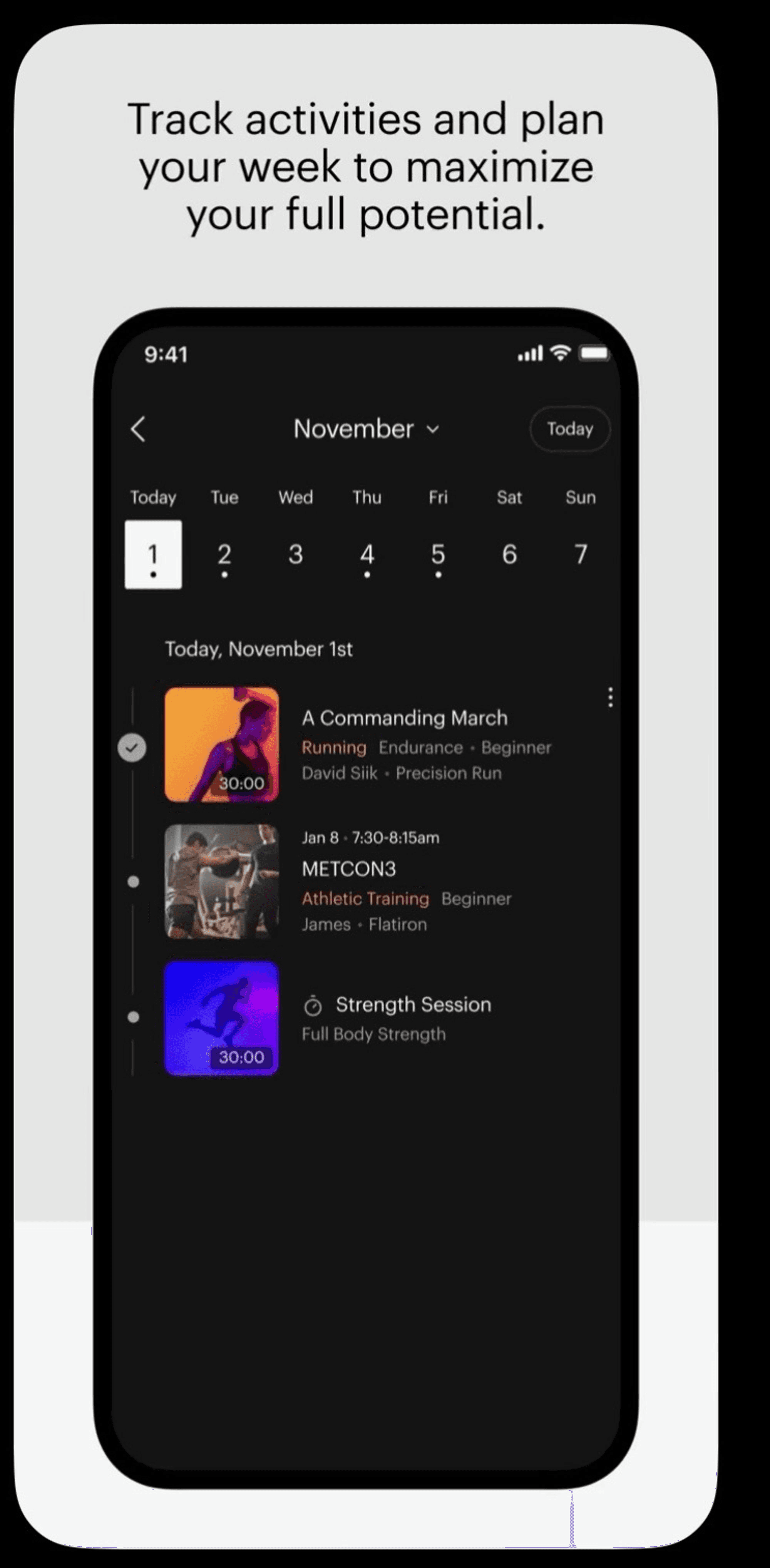
High-Fidelity (Sales Deck)
IDEATION
Although I constantly updated the UI to accommodate functionality changes, I began exploring high-fidelity design concepts to envision the potential appearance of the app. Drawing inspiration from renowned companies such as Apple, Spotify, Nike, and others, I developed my own unique style while staying updated on the latest UI trends. These designs were predominantly featured in slide decks, as the ones used for development still required UX enhancements.

Major Improvements + Design Decisions
IDEATION
In terms of the actual high fidelities for launch, we conducted user testing throughout the process with my team, potential investors, brands, and customers. I'll be discussing the three major improvements/design decisions we implemented to satisfy the user needs and brand identity.
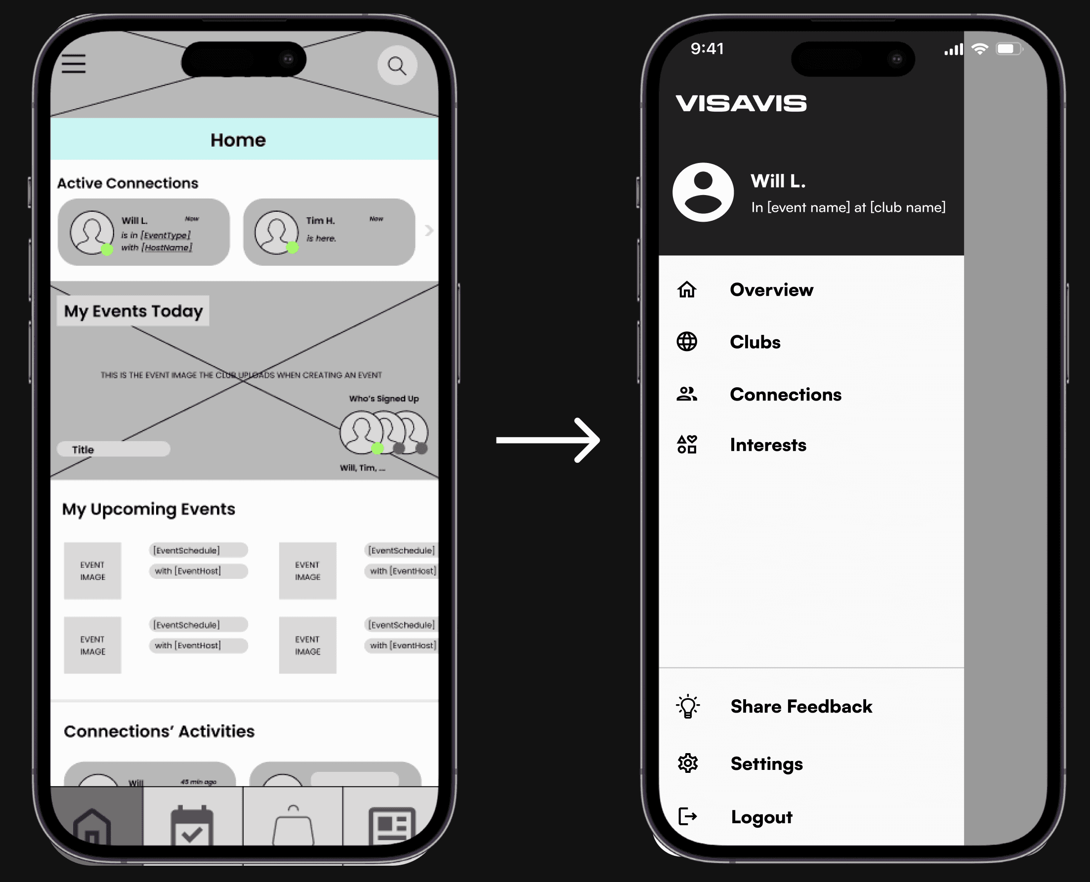
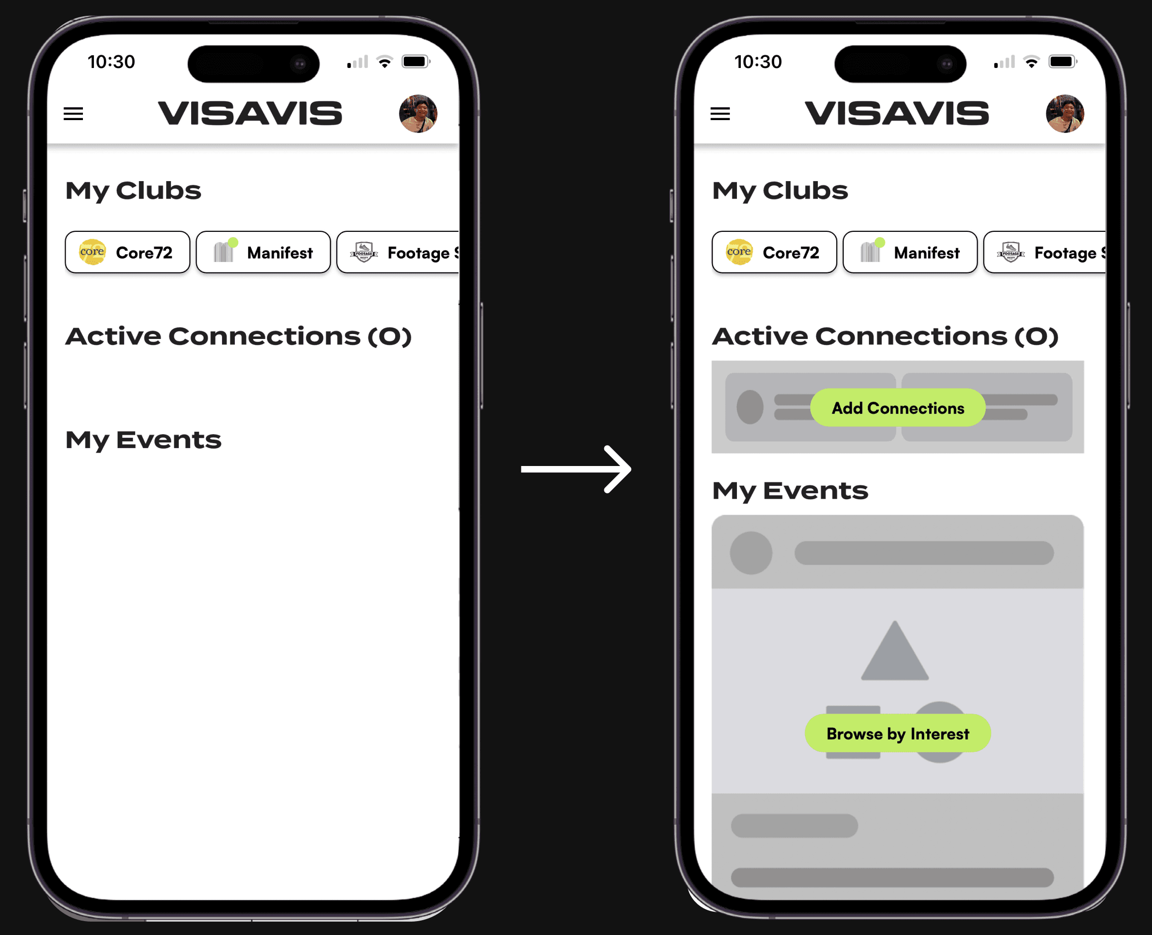
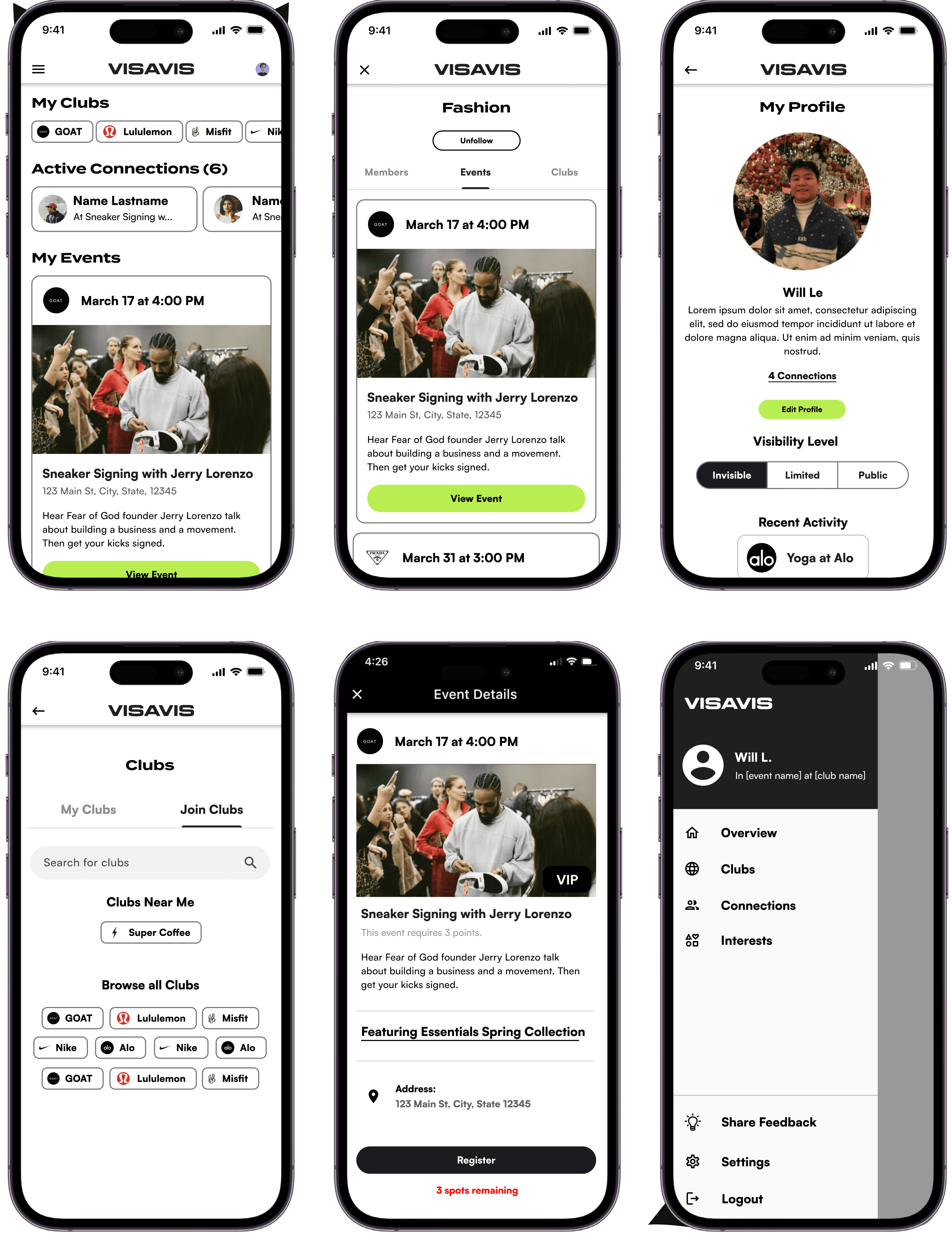
Removing the bottom navigation, as it can cause confusion when switching between Visavis' Home Screen and a Club's Home Screen.
Side navigation provides easy access to the overview, as well as all your clubs, connections, and interests.
Navigation
After thorough user testing throughout the process with my team, potential investors, brands, and customers, here was one of the biggest area I improved to satisfy user needs and wants.
The navigation system from Visavis’ Screens to Club Screens
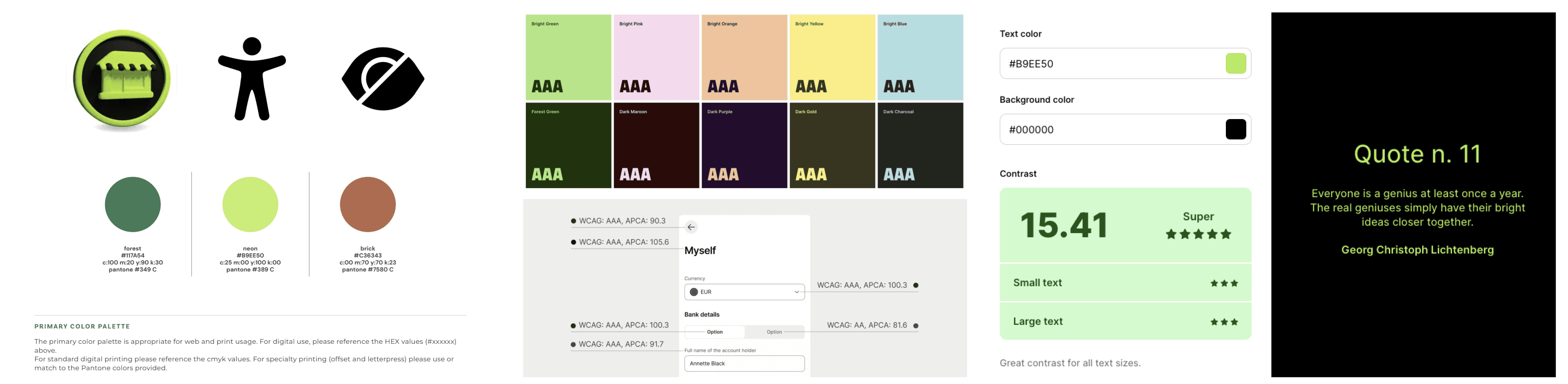
Design Decision (Color)
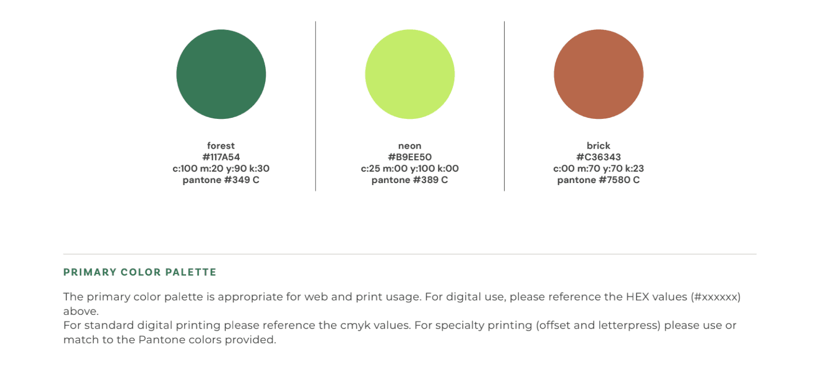
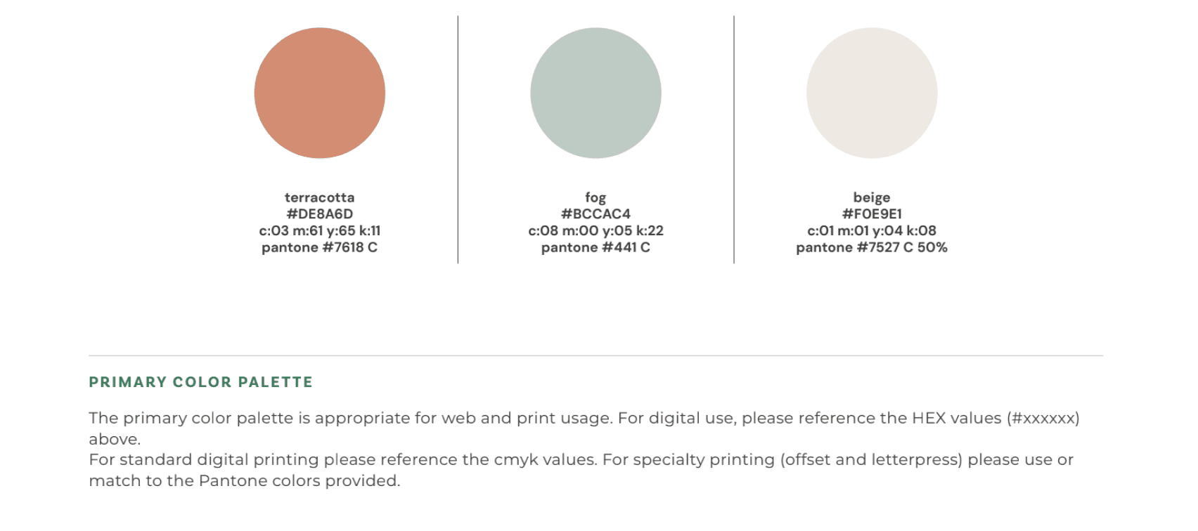
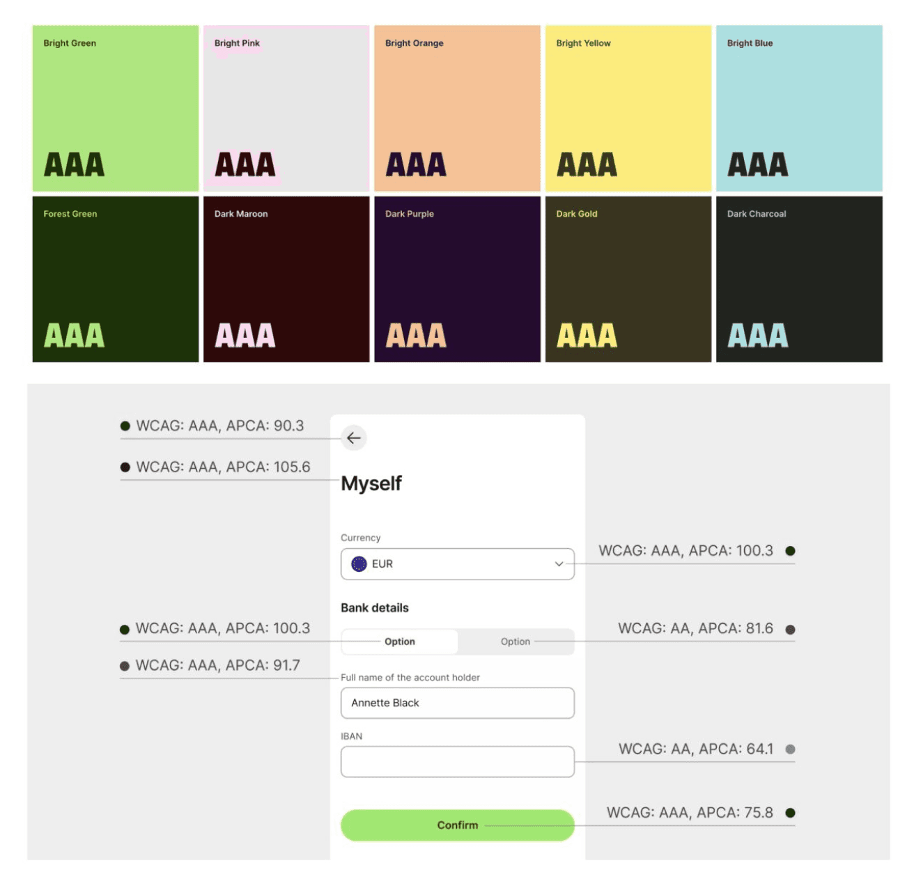
The next major design decision was deciding on the color scheme. After conducting color theory research, we learned that the color green represents "new beginnings and growth," and we wanted to move towards that path. Another crucial aspect we had to consider was designing for accessibility.
To address this challenge, we implemented a solution: a gray placeholder. This approach, commonly used for loading and empty screens, not only minimizes white space but also conveys a sense of incompleteness.
The central green action button was strategically placed to guide users and help them find alternatives for the gray screens.
Empty State
Recognizing the importance of avoiding excessive white space in our app, the last major improvement involved exploring how other successful companies handle empty states.
Improving Empty State Designs: Addressing Challenges within Startups
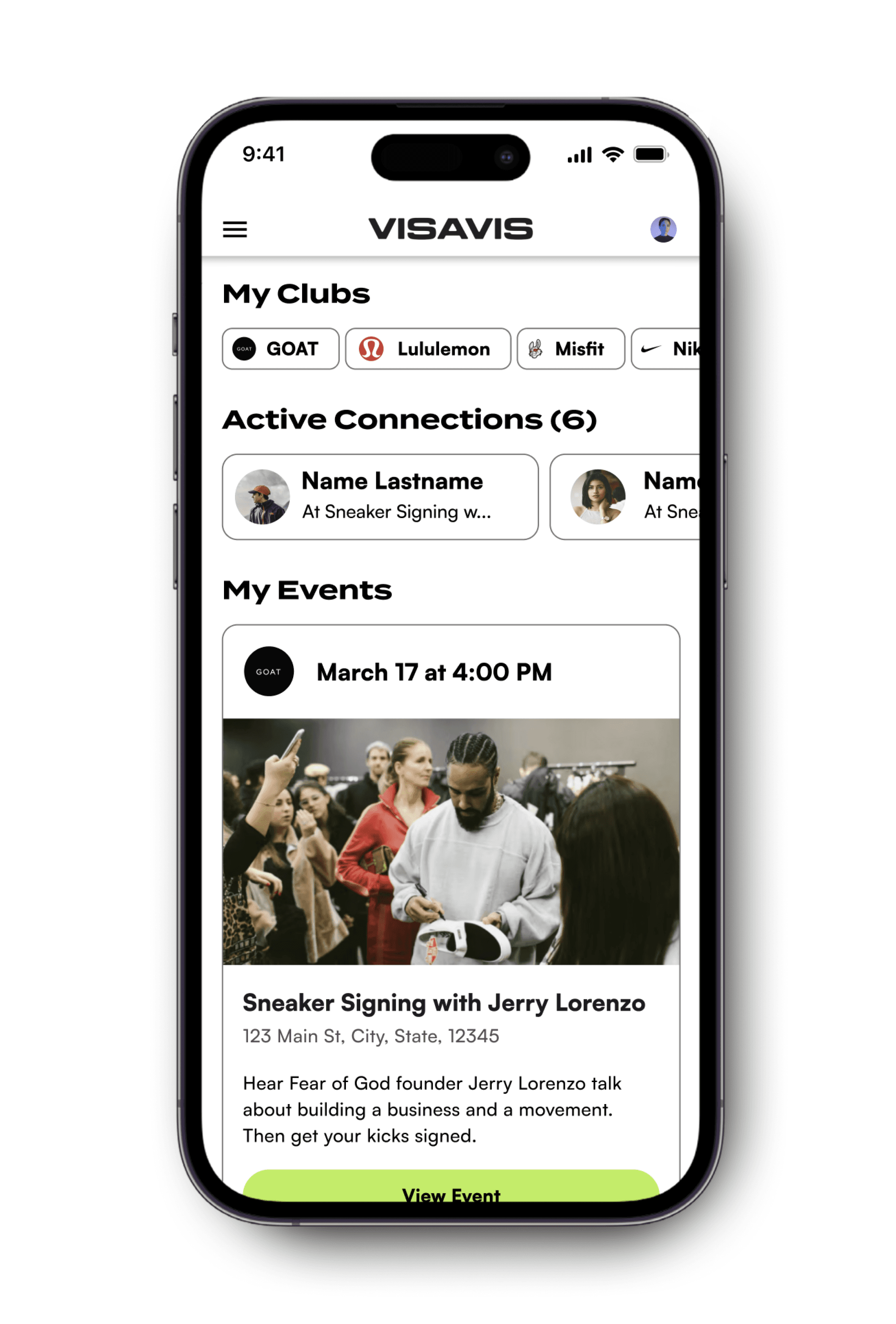
Design System
FINAL DESIGNS
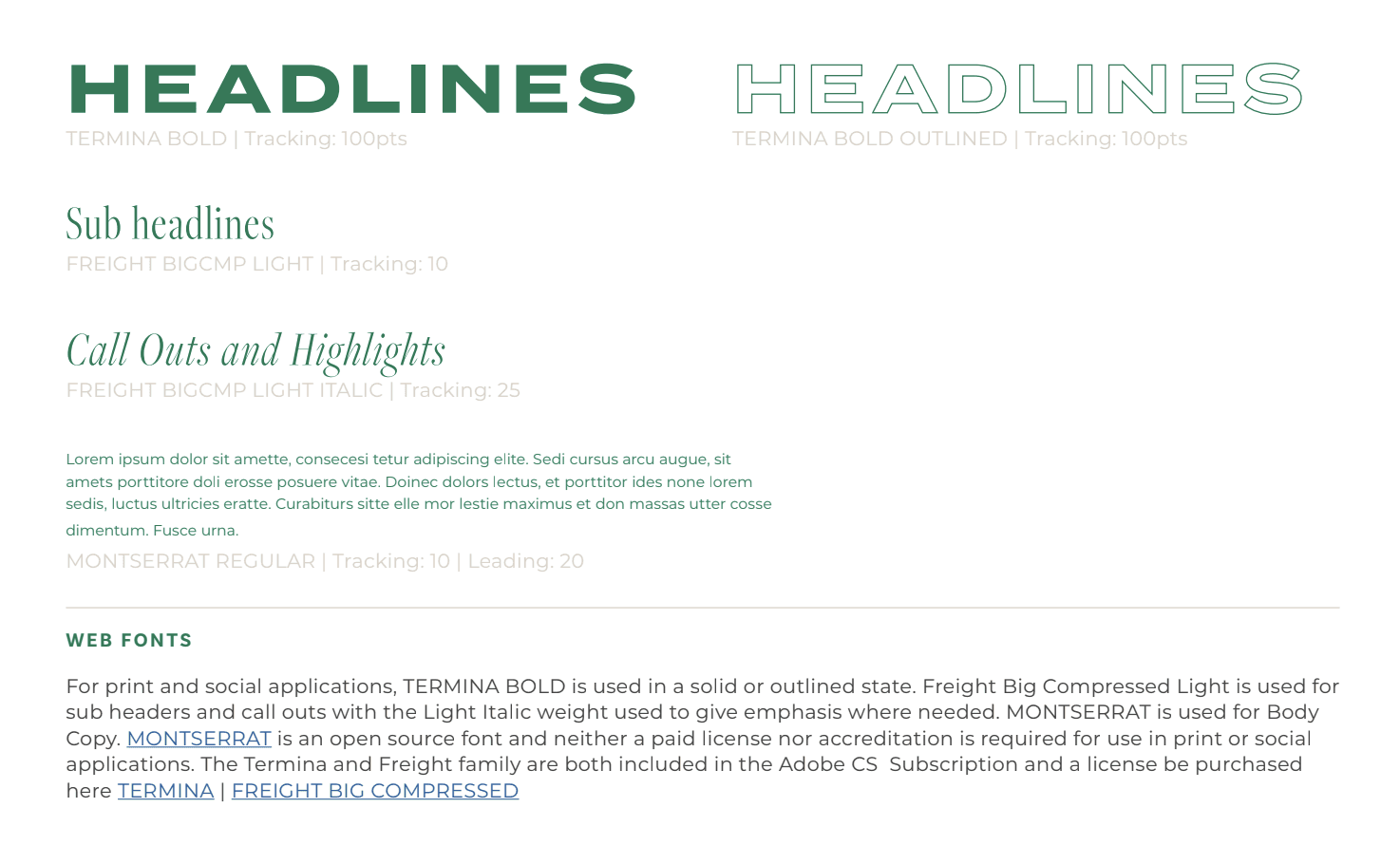
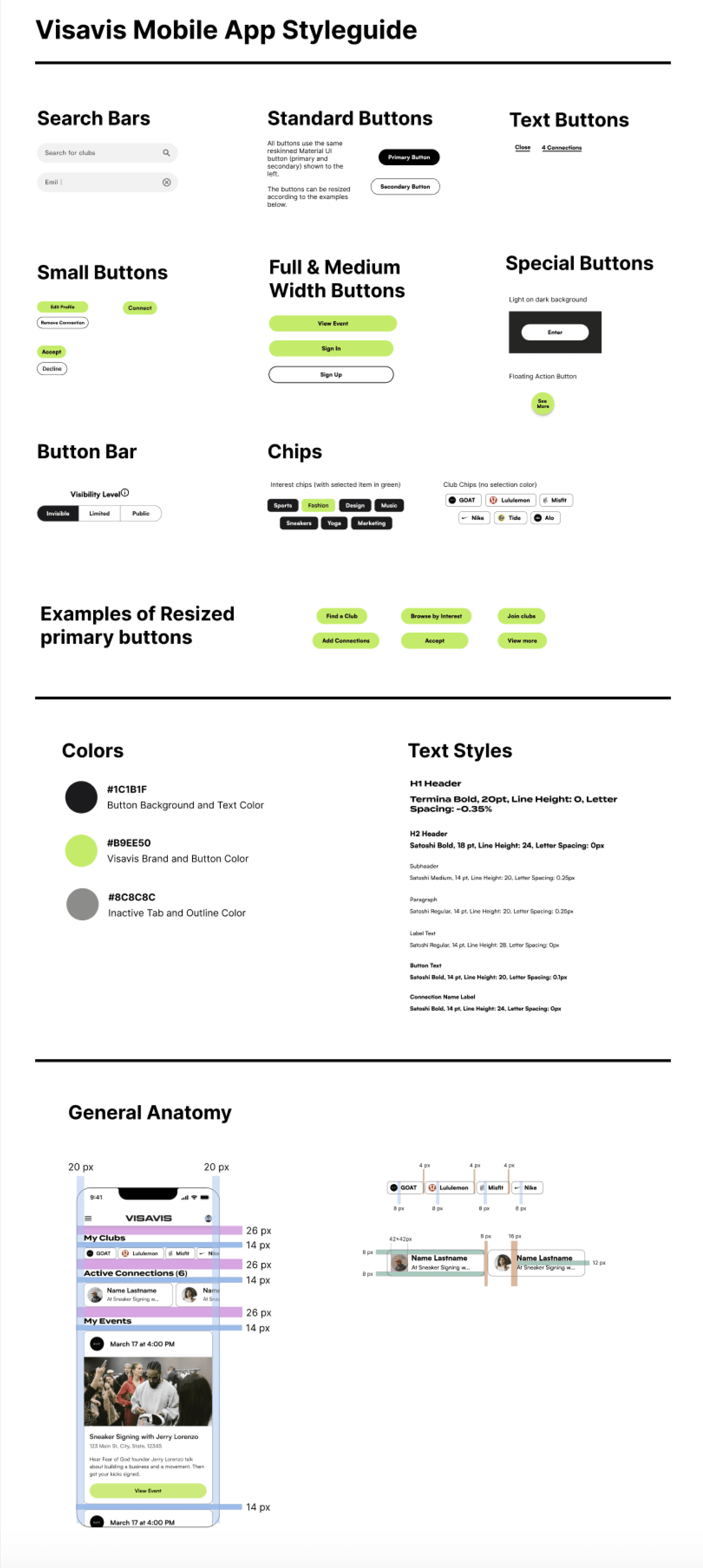
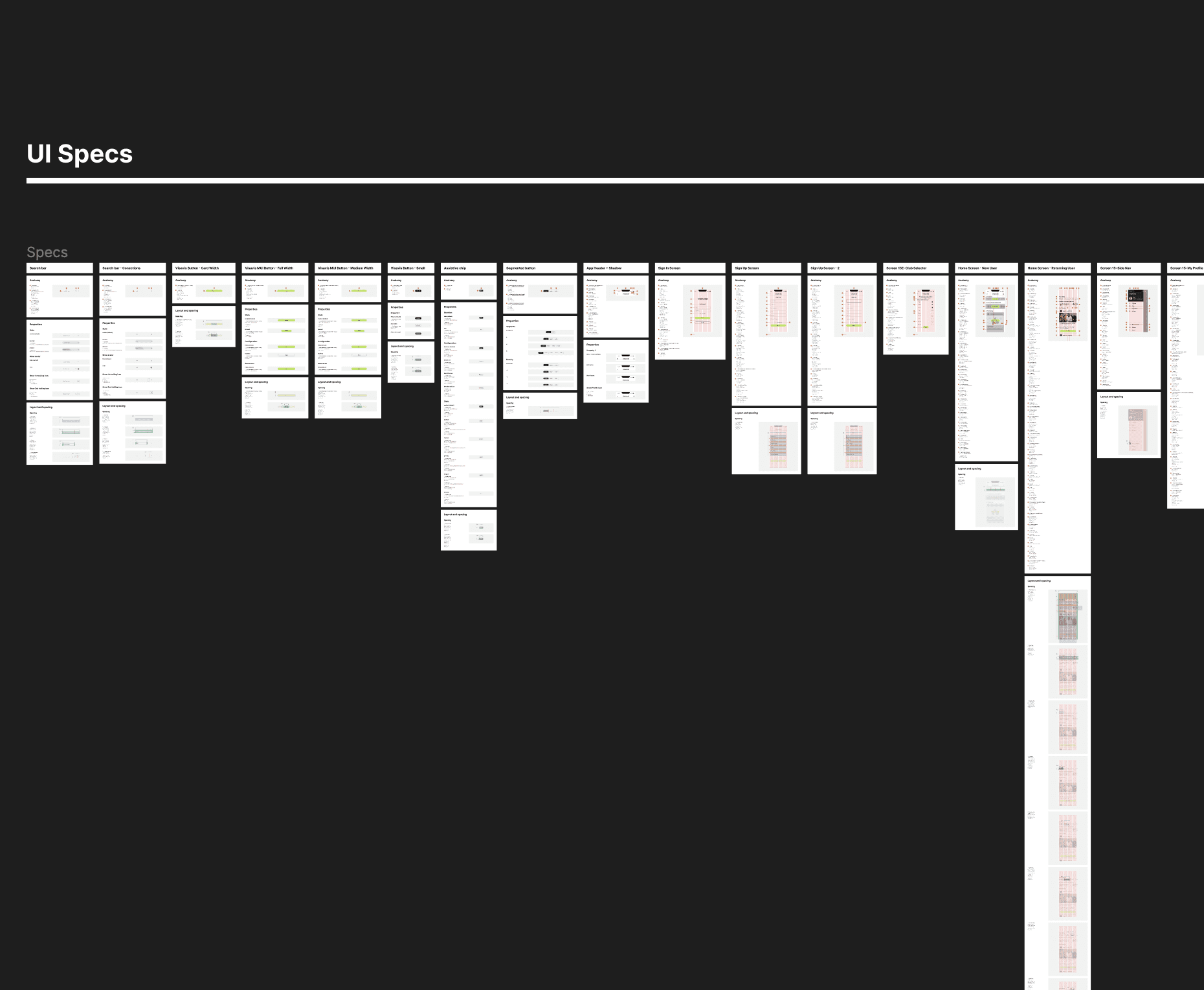
With the creation, iteration, and completion of thousands (yes, thousands!) of wireframes, I successfully finalized the UI Designs for our Pilot phase. To achieve this, I utilized Google's Material 3 UI Components to create the final wireframes. With assistance from another UI Designer, we created a detailed Design System/Style Guide page, which significantly improved consistency in terms of white space, balance, and unity within my designs. This allowed the developers to have easy access to all our design specifications and begin implementing them in the TestFlight app using Flutter.
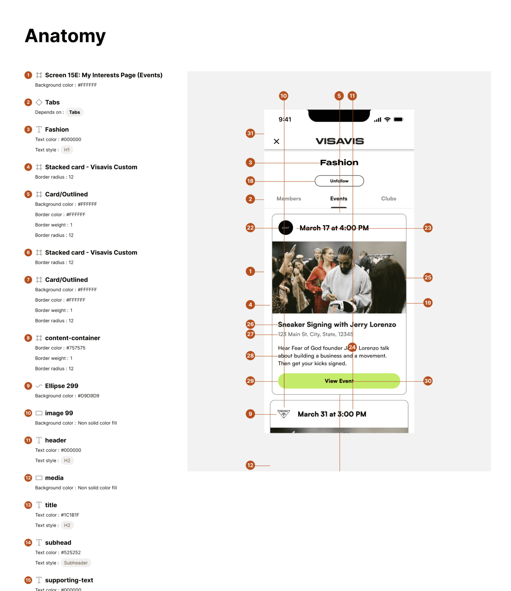
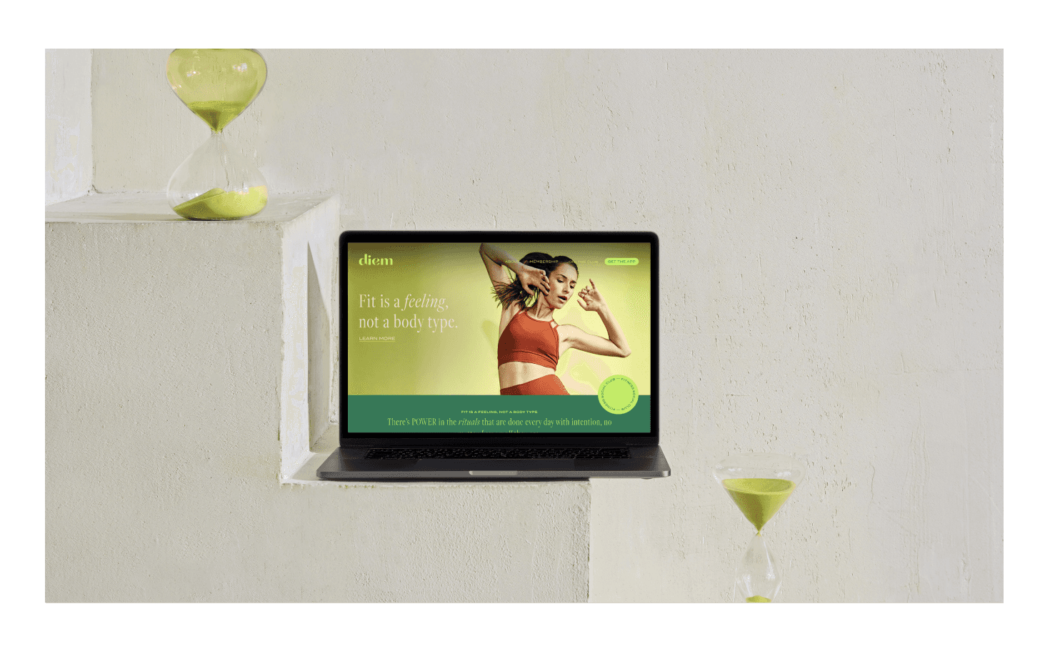
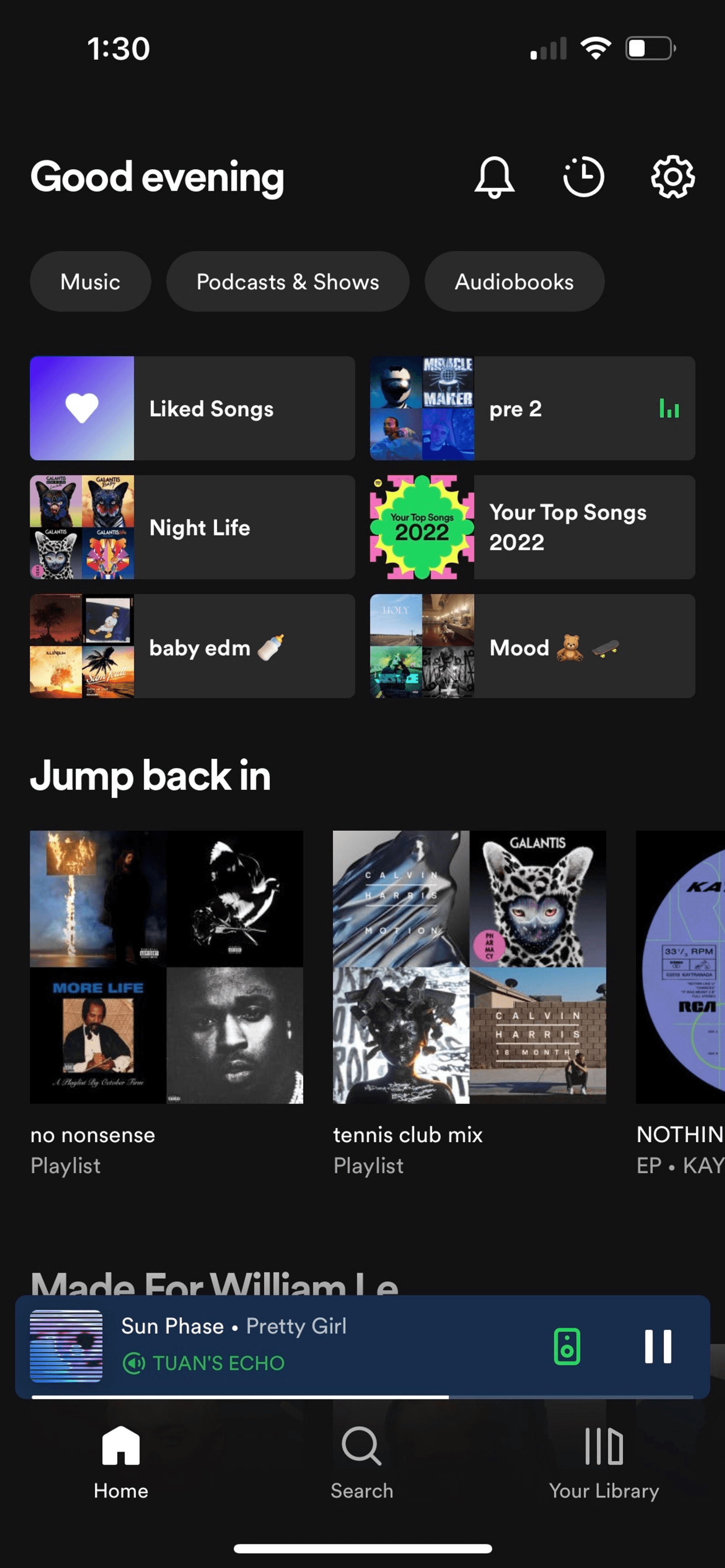
UI for Launch
FINAL DESIGNS
Post Designs Outcome
REFLECTIONS
40 signed brand LOIs in two months (January and February)
Market Validation
8 signed brand contracts in one month (April-May)
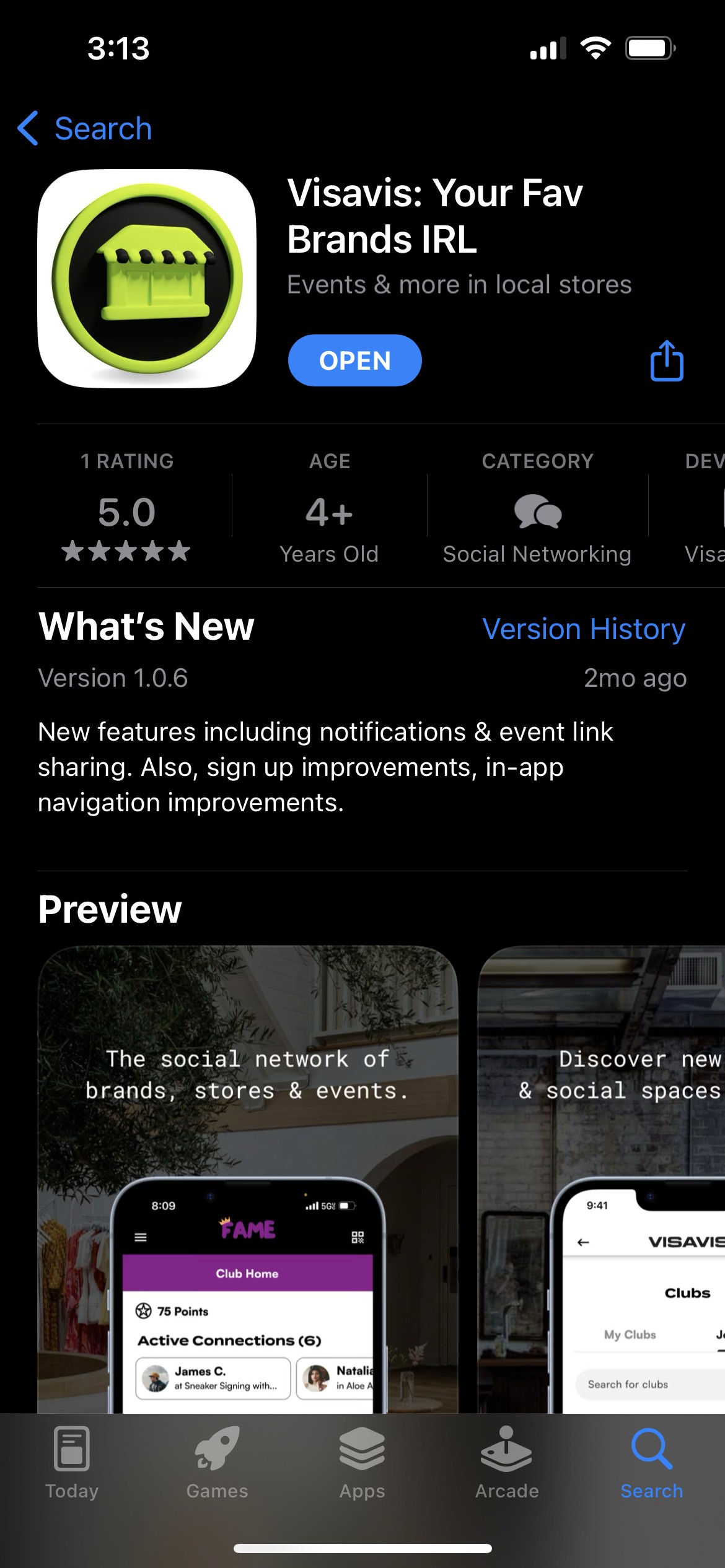
800+ person waiting list for the app
Finished MVP (April 2023)
Product Development
Wrapped Pilot Testing (May 2023)
Public Launch on Apple and Google Play Store (June 2023)
When Will's given tasks, he'll often deliver ahead of schedule and with a high level of accuracy and thoughtfulness. Even with his packed schedule, I never felt like our company (where Will's a freelancer) was a lower priority for him compared to the rest of his responsibilities. In fact, he's felt like a fully committed member of our team from day 1, and to us he absolutely is. I would recommend Will without hesitation to any company or team.
Bridget Regan, CEO @ VISAVIS
Initial Problem Discovery
RESEARCH
After COVID-19, we observed a notable shift in people's desire for authentic, real-life connections. However, the available options for such interactions were found lacking. Traditional spaces like co-working environments, coffee shops, gyms, and bars, while popular, often provided limited experiences that felt somewhat disconnected and independent. Recognizing this societal need for meaningful connections, we aimed to address these challenges specifically within brick-and-mortar retail spaces.
On the other hand, a significant challenge emerged within the realm of online shopping experiences. Brands increasingly converted their physical stores into marketing channels to drive sales, engagement, and gather insights into customer preferences. However, a crucial gap existed in how these brands captured and analyzed in-store interactions. With a predominant focus on optimizing the online shopping journey, the real-life engagement happening within physical stores often went unnoticed and underutilized.
So to define the problem, brands fail to address issues within their brick-and-mortar spaces, causing them to focus on numbers rather than their actual customers, resulting in a decrease in sales and user engagement overall.